
CLIENT
The Gates Distillery d.o.o.
BRAND
THE GATES
TYPE
BRANDING, PRODUCT PACKAGING, VERBAL COMMUNICATION
Welcome to The Gates Distillery — The Gates Distillery is a premium
Croatian distillery, nestled in the heart of Rijeka, a city known for
its rich maritime heritage. The name "The Gates" evokes the city’s
striking coastal landscape, where the gateway passages between the
islands and the mainland have long symbolized the region’s prosperity
and seafaring tradition. Rijeka, located along the picturesque Kvarner
Bay, offers its residents breathtaking views of the two renowned
maritime straits — Srednja Vrata (Middle Gate, between the islands of
Krk and Cres) and Velika Vrata (Great Gate, between Cres and the Istrian
Peninsula). These historic passages have been vital to the city’s role
as the largest seaport in Croatia, shaping its rich history and culture.
At The Gates Distillery, we honor this maritime legacy through our
carefully crafted spirits, blending local tradition with exceptional
craftsmanship.
Our name and visual identity are a tribute to
Rijeka’s enduring maritime spirit — each bottle we produce is a
celebration of the city’s seafaring past and its continued dedication to
excellence.
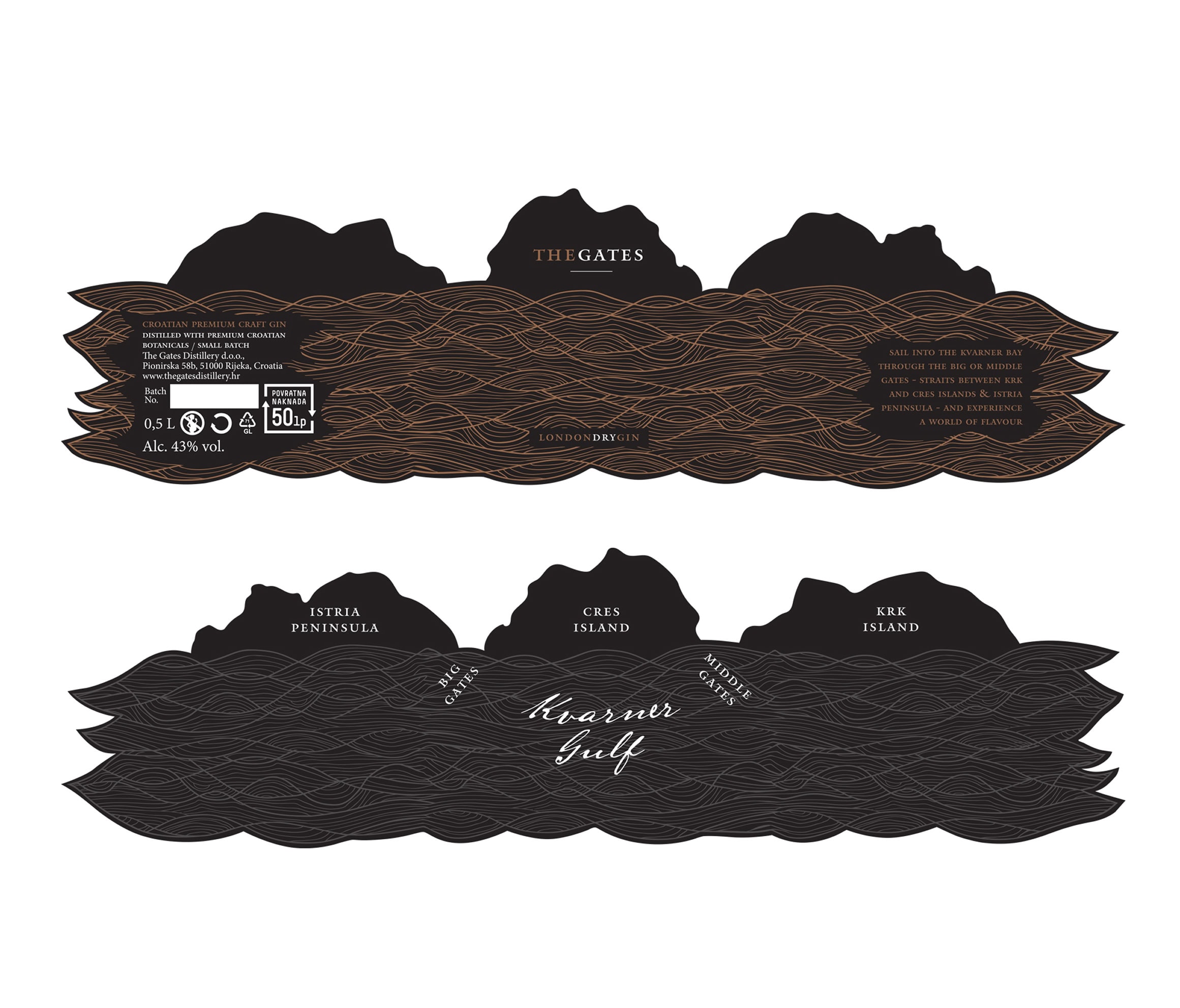
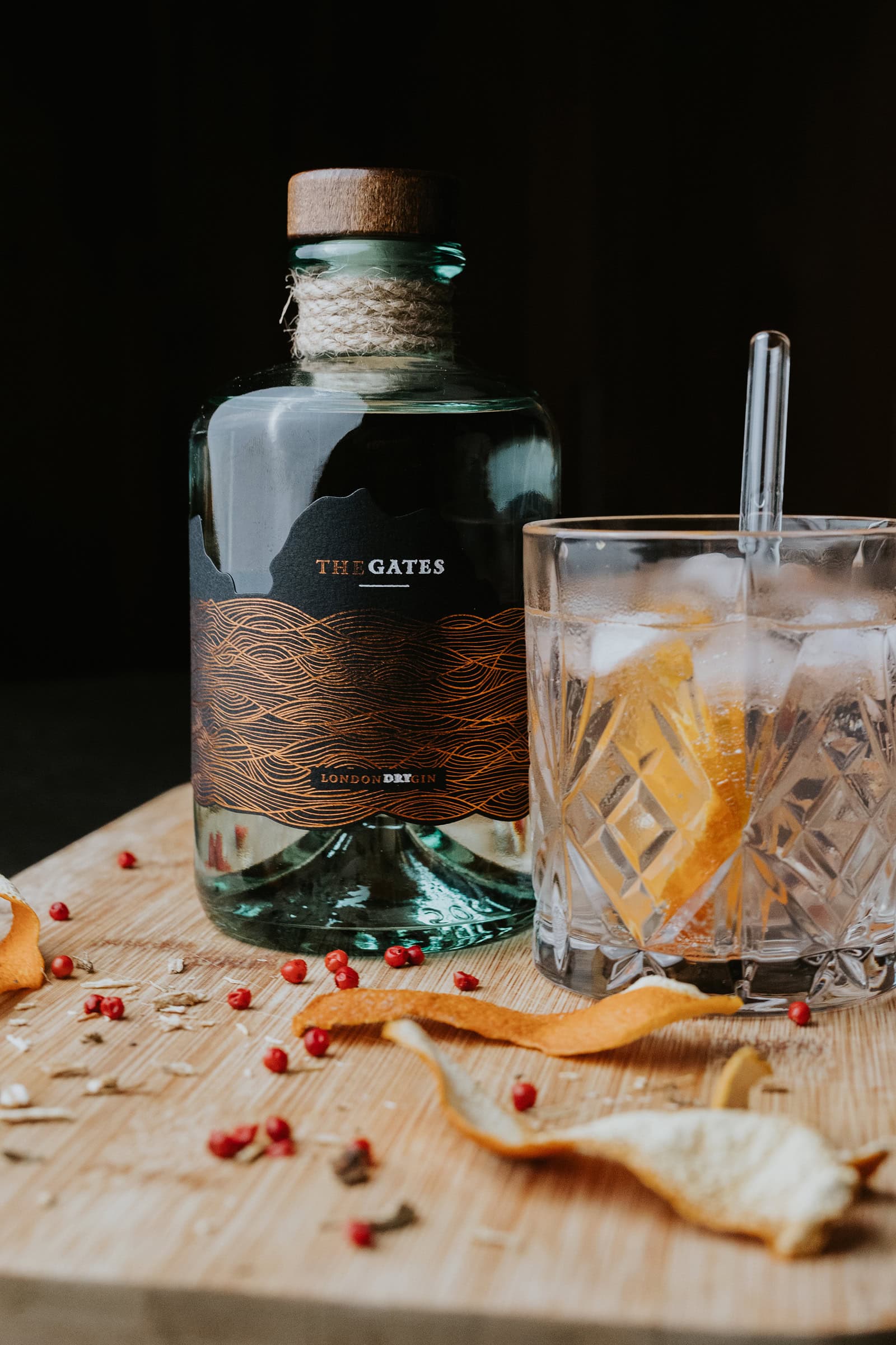
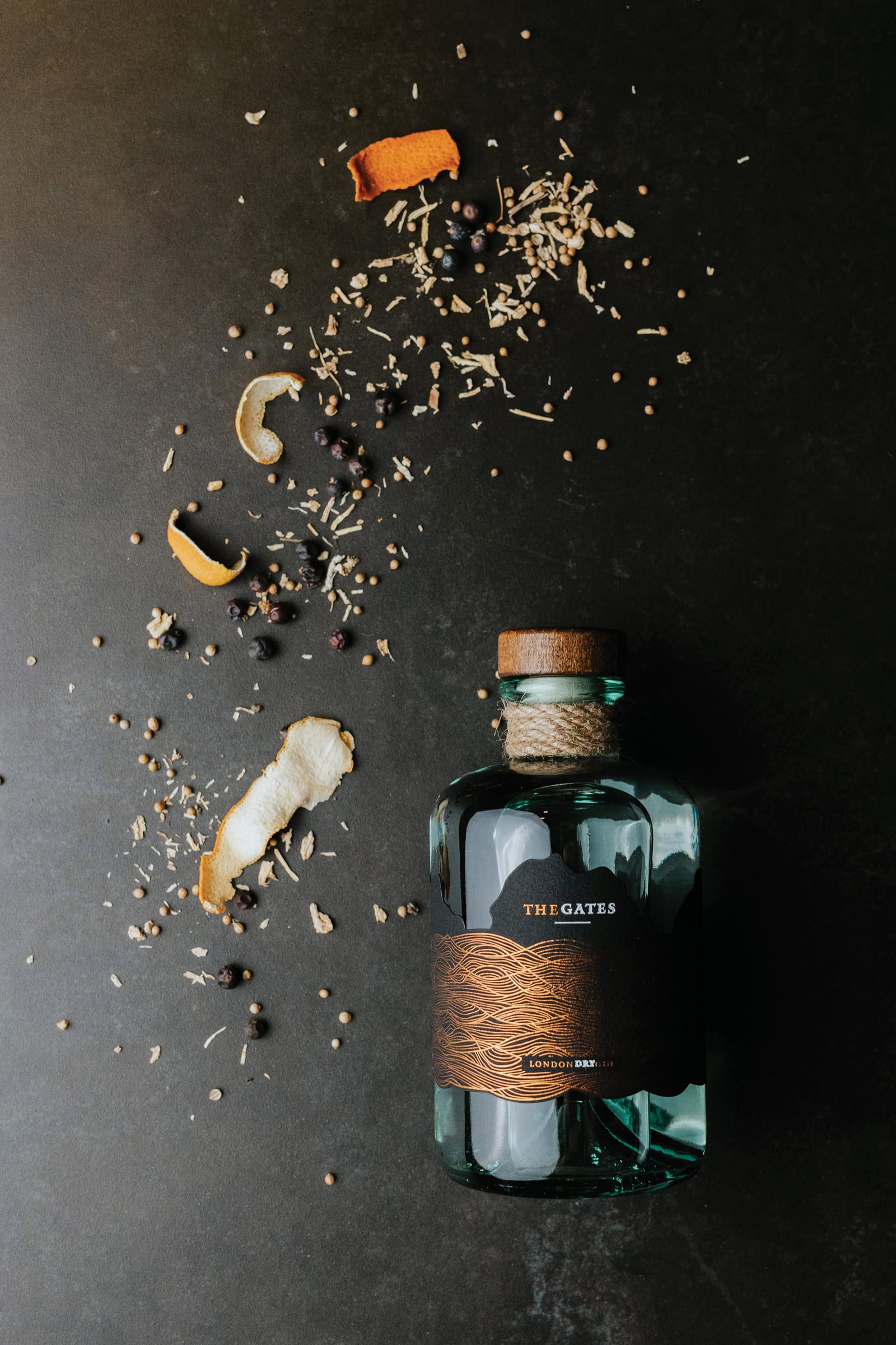
Visual Identity — The core of The Gates
Distillery’s visual identity—reflected consistently across the entire
packaging design lies in a series of flowing lines that evoke the motion
of sea waves. These design elements subtly reinforce the distillery’s
deep connection to its coastal setting, emphasizing the sea as both a
geographic anchor and a vital force in the life and legacy of the
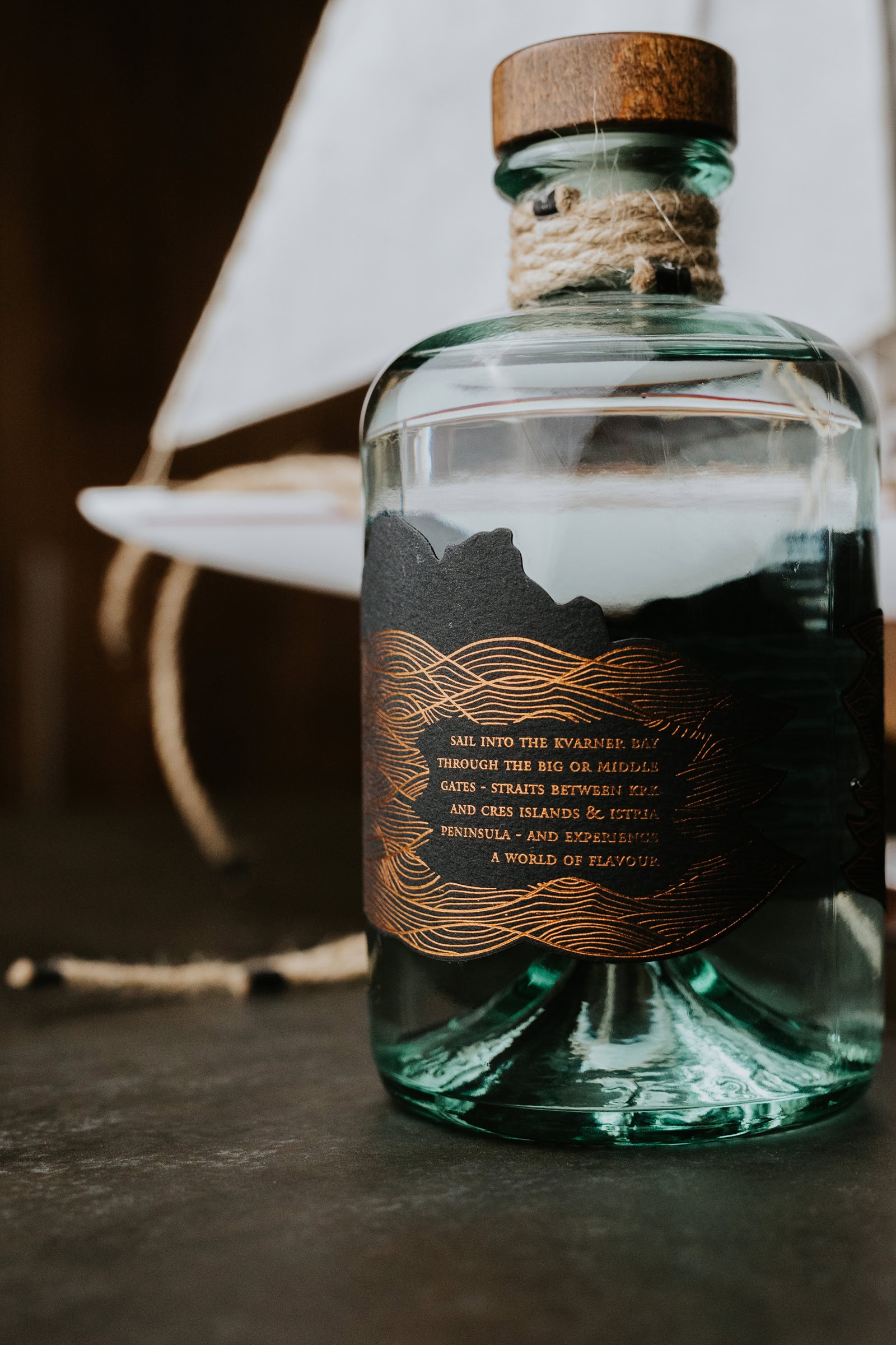
region. So... Sail into the Kvarner Bay through the Great or Middle
Gates the straits between the islands of Krk and Cres, and the Istrian
Peninsula—and discover a world of flavor.
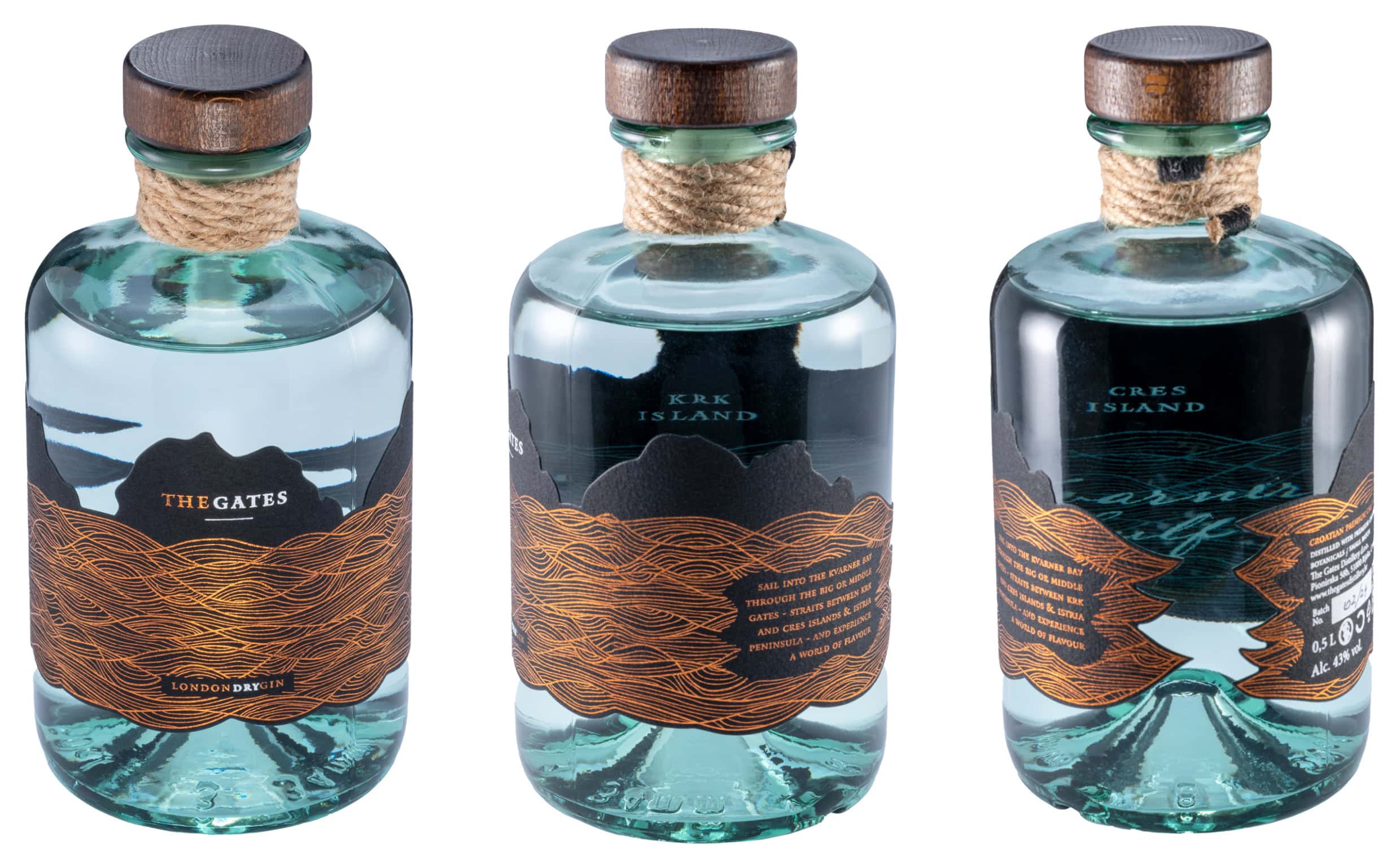
Design Inspired by Place and Tradition The name “The Gates”, along
with the bottle and label design, pays homage to Rijeka’s
deep-rooted maritime heritage. It reflects not only the spirit of
the city, but also its unique geographic identity, embedded in the
everyday life of its people. The bottle features a dual-label
design: The front label introduces the brand’s story in a concise,
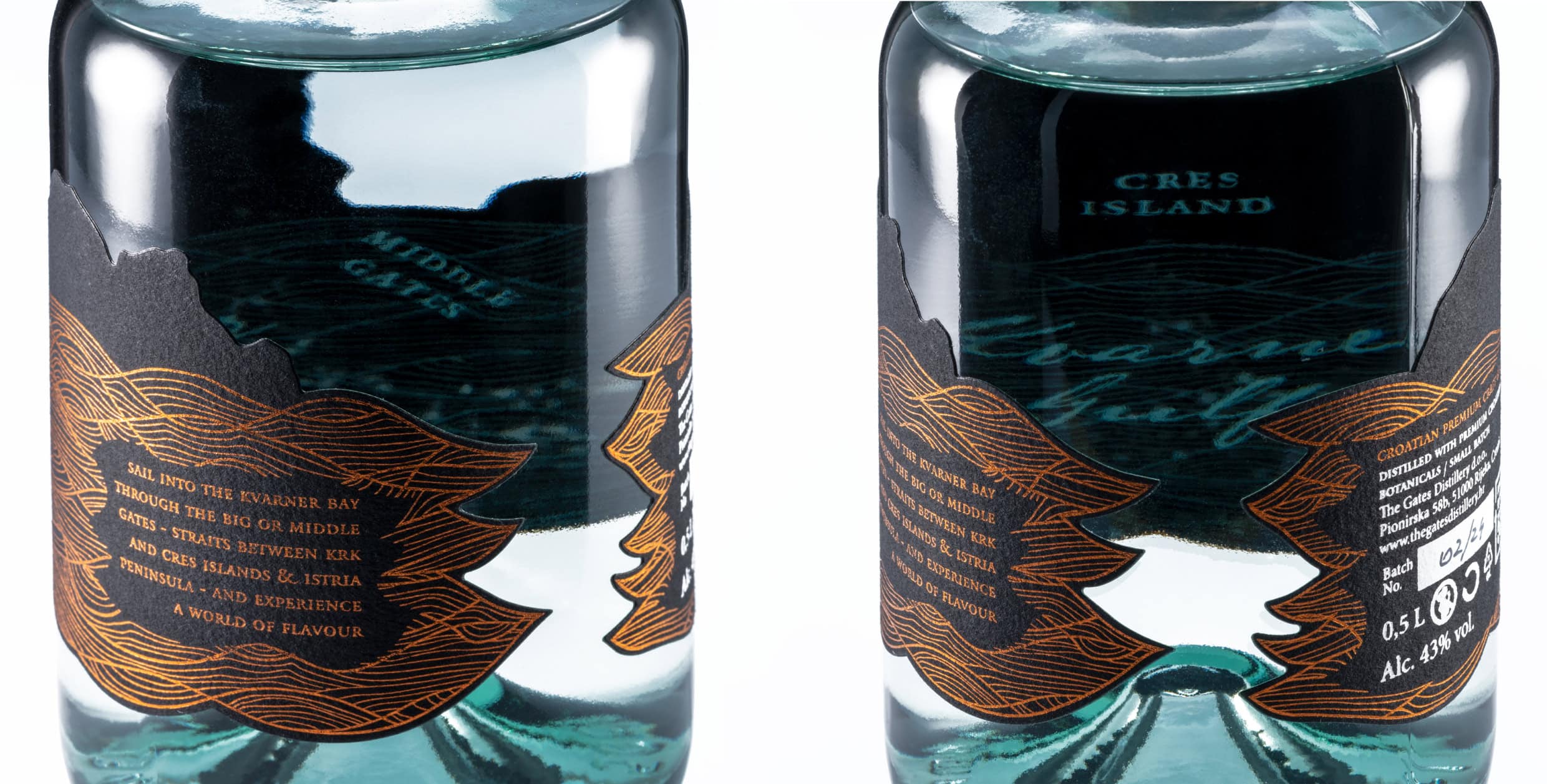
elegant narrative. The inner label, printed directly onto the glass
in a no-label look style, reveals a subtle “map-view” of the Kvarner
straits—the natural sea gates that greet Rijeka’s residents every
day. Crafted from deep black cardstock and stamped with copper
foil—reminiscent of the sea at sunset—combined with crisp white
accents, the label creates a refined and tactile experience.
To complete the design, the neck of the bottle is wrapped with a
miniature rope, inspired by traditional maritime rigging, adding a
final touch that anchors the brand in its seafaring roots. Every
detail is a nod to the Adriatic, to Rijeka, and to the timeless
relationship between the sea and craftsmanship.


So… get your brand to look nice and speak wise!