CLIENT
OPG KOS
BRAND
BLACKBIRD'S ENERGY BAR
TYPE
BRANDING, PRODUCT PACKAGING, VERBAL COMMUNICATION
The branding project for the Blackbird energy bar series is designed
exclusively for international markets. It includes the development of
verbal communication (slogans) and conceptual visual guidelines to
support future brand extensions. The producer’s primary focus is on
creating products based on organic chokeberry.
Blackbird’s energy bars are vegan and crafted from a blend of
chokeberry, hazelnuts, apples, nuts, seeds, and other natural
ingredients of certified organic origin. The brand proudly holds
eco-certifications, with manual production as its greatest strength —
adding uniqueness and credibility to the product.
The brand’s visual elements, name, and identity are inspired by the
family surname — Blackbird. Consequently, the product series carries
the manufacturer’s name, and its design incorporates key elements of
the existing visual identity, which had to be partially preserved due
to the brand’s long-standing market presence.
The product
name is an English translation of the Croatian family surname,
reflecting the manufacturer’s family heritage. This approach
reinforces the family aspect of the brand while fostering consumer
trust by associating it with a healthy lifestyle and the creation of
local delicacies. This message is further strengthened through the
verbal communication slogan: “House of Healthy Products.”
The choice of the name strongly influenced the art direction and
creative approach to the packaging design. The design needed to be
adaptable to various flavor combinations while maintaining a cohesive
identity for the manufacturer’s products, all centered around the key
ingredient — organic chokeberry.
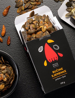
This solution allowed for the incorporation of the existing graphic
element of the blackbird, which was thoughtfully placed within a
visually logical space — the shape of a birdhouse positioned prominently
in the center of the packaging.
Blackbird’s energy bar packaging is positioned within the premium
product category, with its innovative cardboard box design standing out
in this specific niche.
The use of vibrant watercolor
strokes and colors against a dark background evokes the craftsmanship
and manual production behind the product.
Each packaging
color highlights the product’s key ingredient, while the striking
contrast between intense hues and the dark backdrop creates a dynamic
and energetic visual expression—reflecting the core of the project’s
strategy.
All design elements were specifically created to meet the communication
needs of the Blackbird project, allowing for versatile combinations that
support future brand extensions.
The successful branding, along with the tagline “House of Healthy
Products,” has significantly increased the popularity and visibility of
Blackbird’s products, making the brand appealing to its target audiences
and competitive in international markets.


So… get your brand to look nice and speak wise!