CLIENT
JELENA BOŽOVIĆ LAW FIRM
BRAND
JELENA BOŽOVIĆ LAW FIRM
TYPE
VISUAL IDENTITY
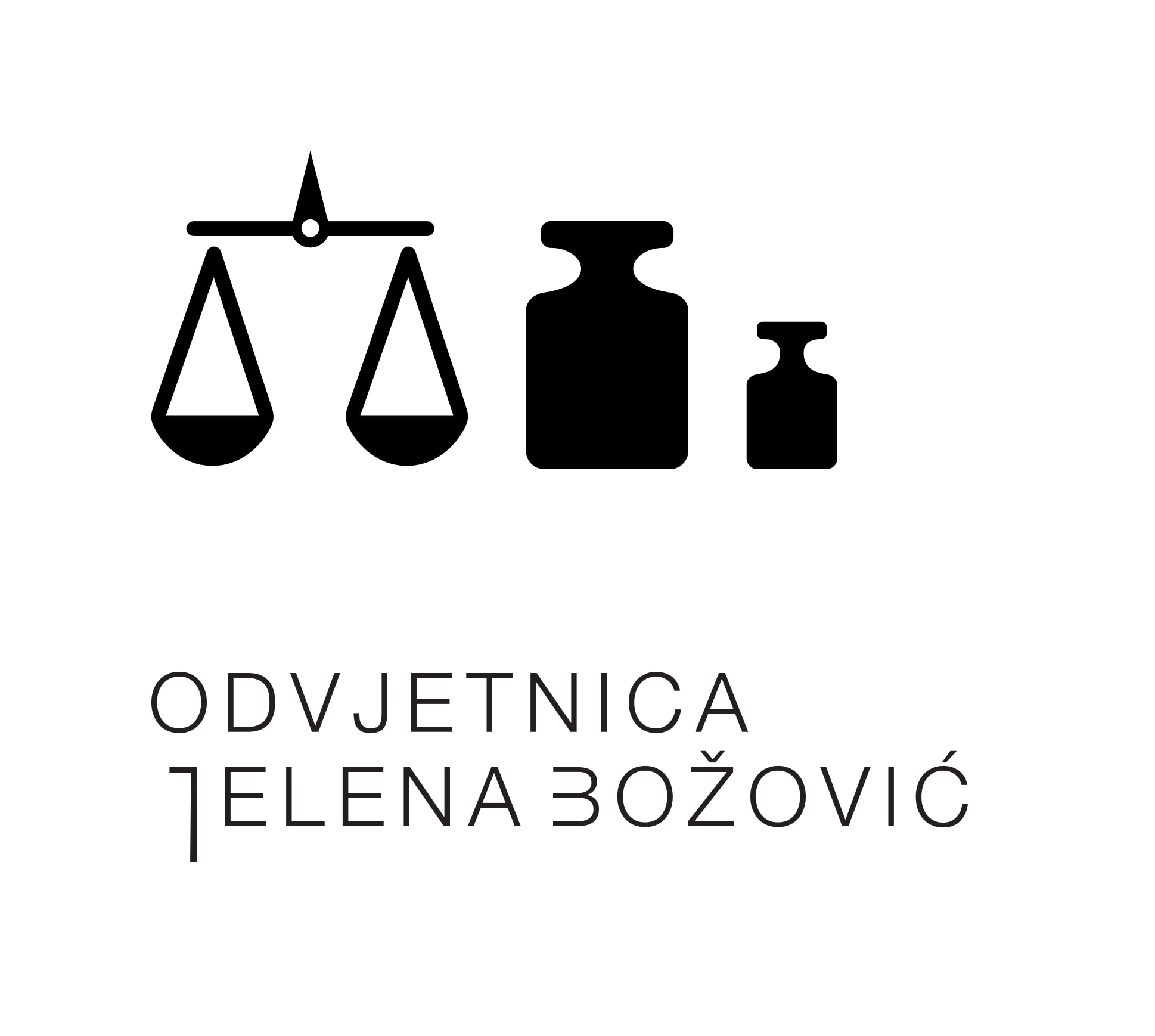
The visual identity of the law firm Jelena Božović is built around recognizable symbols traditionally associated with the legal profession. While it incorporates familiar graphic elements and established visual references, the design approach is fresh and distinctive, setting it apart from conventional legal branding. This thoughtful balance between professional symbolism and creative execution reinforces both credibility and uniqueness in a competitive field.
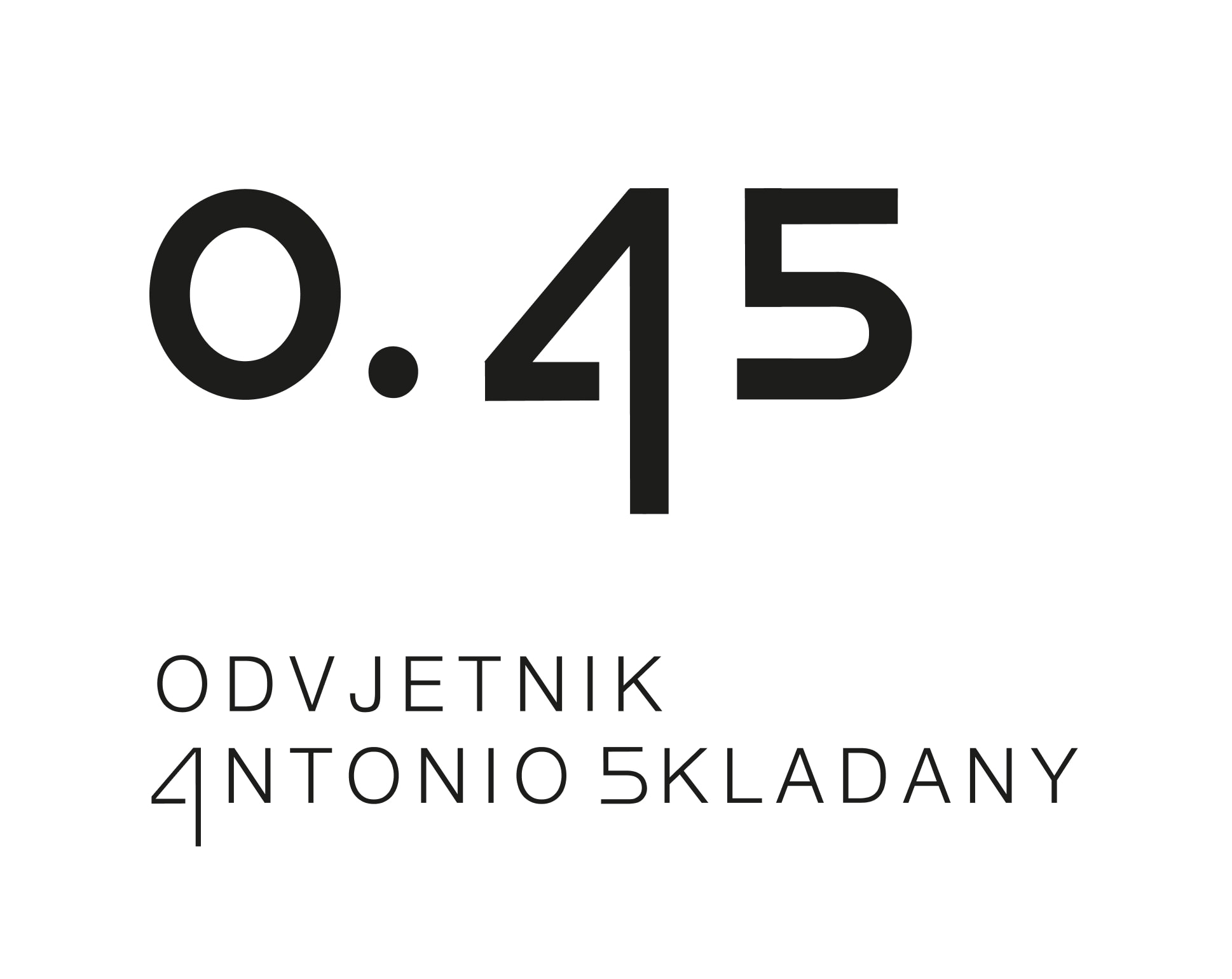
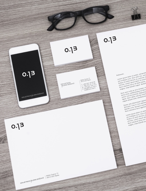
The concept is rooted in the symbol of justice – the scales, representing balance and equality. Building on this foundation, the visual identity was developed using the initials of the law office, OJB (Odvjetnica Jelena Božović). Rendered as O.13, the mark evokes both the imagery of weights on a scale and a stylized, professional monogram. This clever design solution bridges legal symbolism with a contemporary graphic identity, offering a strong, recognizable visual for the firm.
The overall identity was crafted so that every graphic element stems from the core concept — scales and balance — translated into a modern, minimalist black-and-white visual system. This distinctive approach reinforces the values of precision, clarity, and integrity, while setting the firm apart through a timeless and elegant aesthetic.


So… get your brand to look nice and speak wise!