CLIENT
COPABIANCO D.O.O.
BRAND
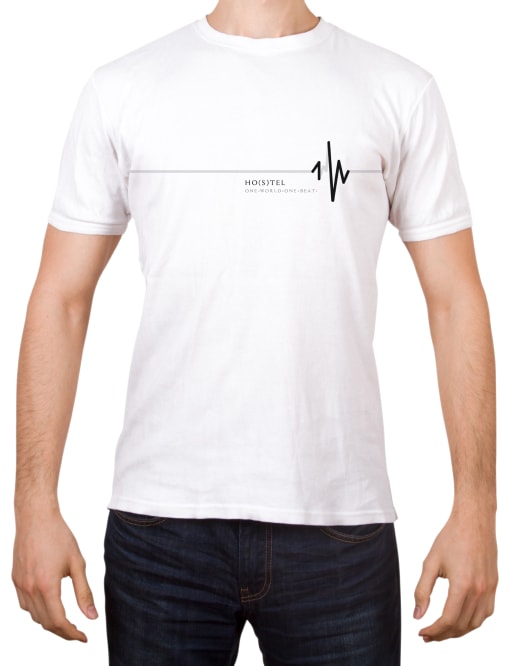
DESIGN HOSTEL ONE WORLD - 1W
TYPE
VISUAL IDENTITY, VISUAL AND VERBAL COMMUNICATION
The One World (1W) hostel project encompasses creative strategy, concept
design, visual identity development, comprehensive visual and verbal
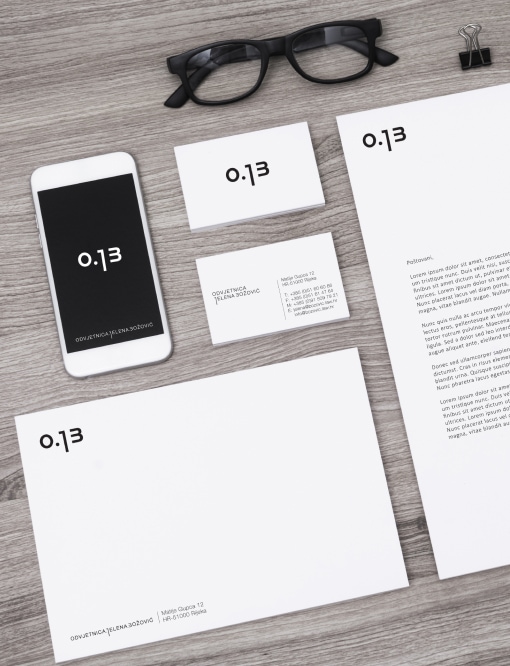
communication, as well as the design of promotional materials, business
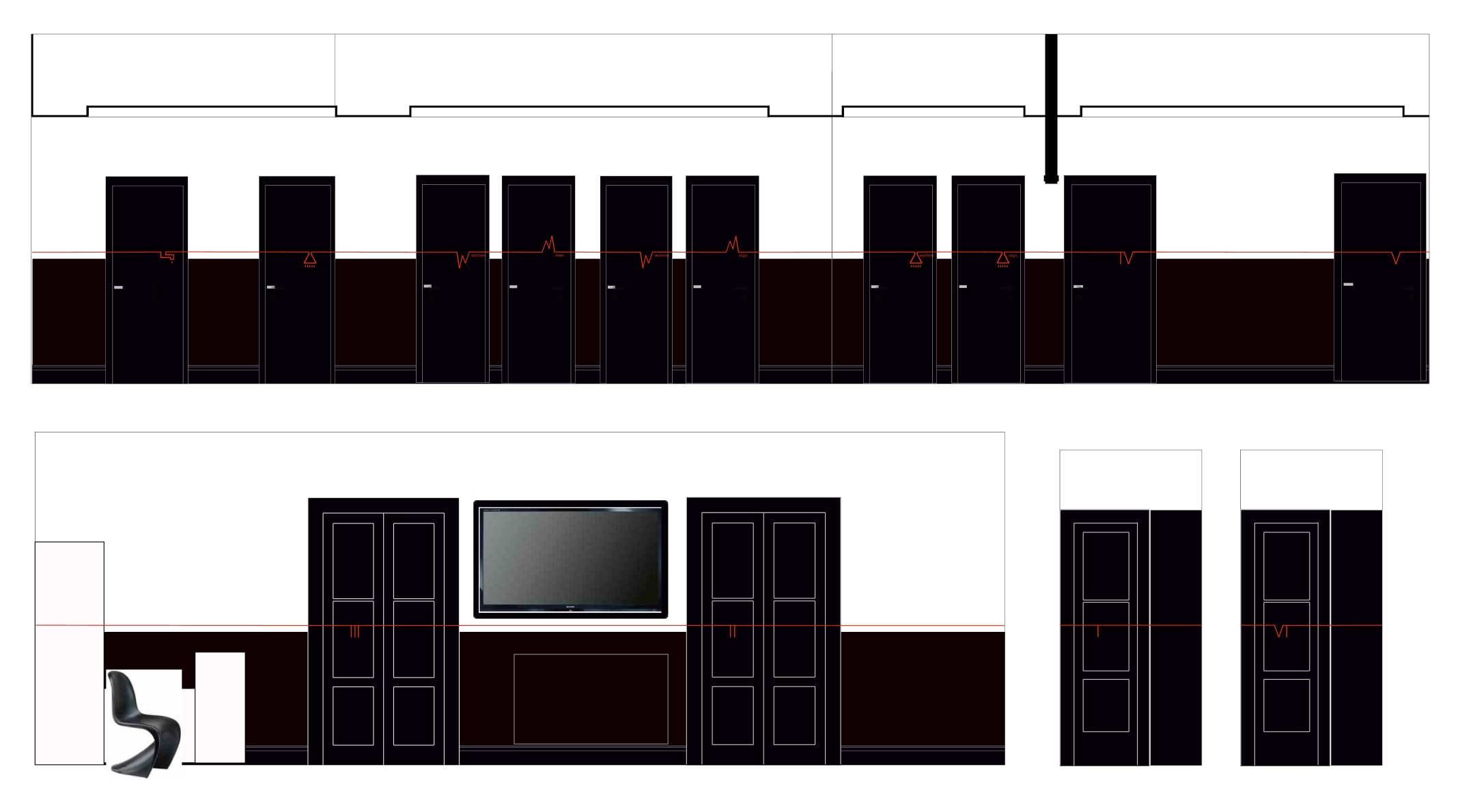
stationery, interior pictograms, and signage.
The development of the One World (1W) visual identity was realized
through close collaboration between the owners—passionate travelers with
a clear vision—and a team of award-winning professionals in interior
design, branding, photography, and art. The project was thoughtfully
crafted to ensure a final result that satisfies both investors and the
target audience.
The hostel’s name, “One World – 1W,”
reflects the owners’ life philosophy: a belief in the world as an
infinitely free space without boundaries—whether religious, sexual, or
political. “One world, one life – one beat” serves as the foundation and
guiding principle for all visual and conceptual elements of the project.
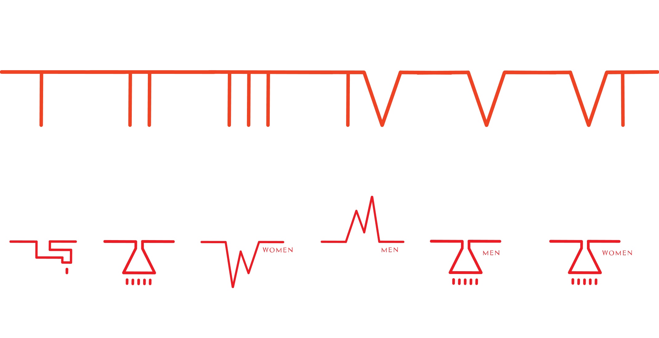
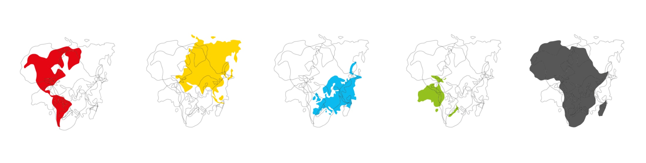
Building on the concept of “one shared heartbeat,” the visual identity and interior design reflect this theme deeply. Each hostel room represents a different continent, marked by its characteristic color—Europe in blue, Asia in yellow, and so on—and enriched with visual references to notable cultural symbols (such as Michelangelo’s David for Europe, Aboriginal art for Australia, cowboys for America). The shape of each continent is subtly integrated into the wall graphics to reinforce this identity.
All rooms, along with the hostel’s unique worldview, are connected by a red “heartbeat” line. This line is the foundation for the hostel’s visual identity—the heartbeat forming the name 1W – One World. The overlapping shapes of the continents create a heart shape, symbolizing unity: one world, one heart.
Color Palette


So… get your brand to look nice and speak wise!