CLIENT
ART OF JUICE D.O.O.
BRAND
MR. JOOS
TYPE
BRANDING, PACKAGING, VISUAL & VERBAL COMMUNICATION
The development of the Mr. Joos project encompassed the entire branding
process — from naming and brand concept, through creative strategy and
verbal communication, to the visual identity and packaging design. Mr.
Joos offers a range of unique juice recipes, delivering high-quality,
nutrient-rich products without added sugars, flavors, additives, or
preservatives.
These 100% natural, fresh, and unpasteurized
juices are crafted for the modern consumer with a hectic lifestyle. They
are distributed not only through retail chains but also in bars,
restaurants, fitness clubs, and health food stores. The brand’s visual
identity is driven by a creative concept aligned with its strategy and
market positioning.
Mr. Joos stands out as the only juice brand on the market that preserves
the natural integrity of its ingredients through an exclusive cold-press
technology. This innovation positions Mr. Joos as the premium vitamin
drink — the true “mister” among juices: Mister 100% Juice.
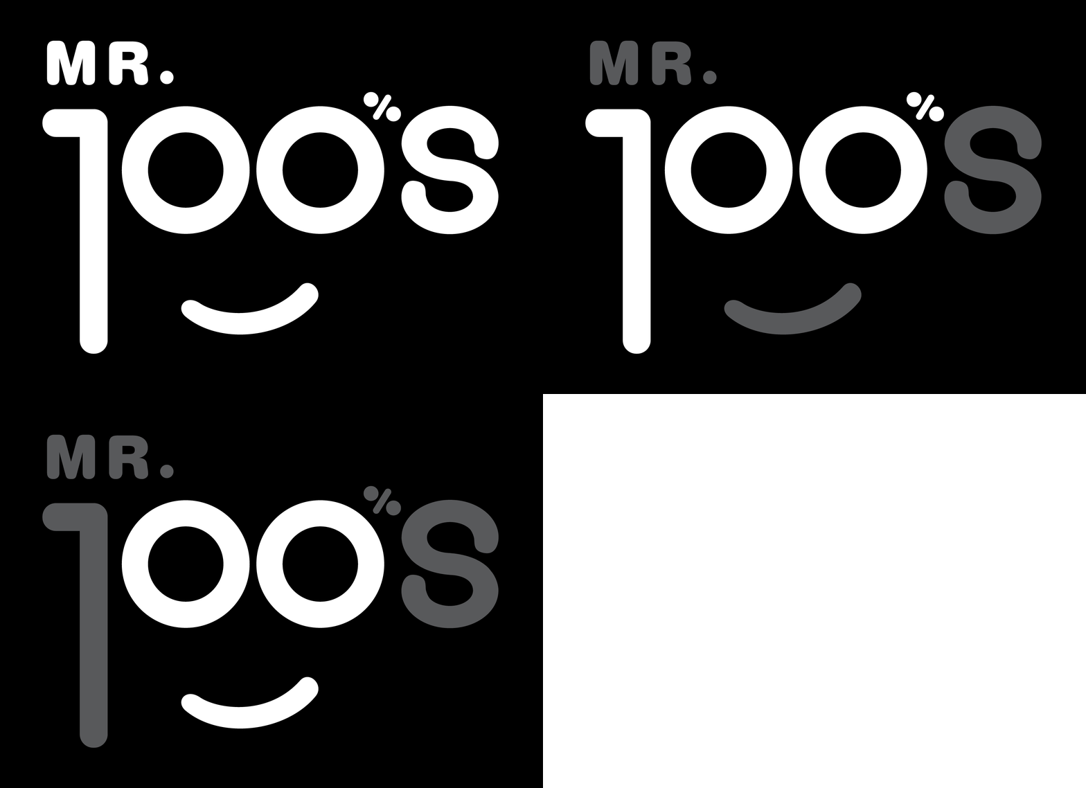
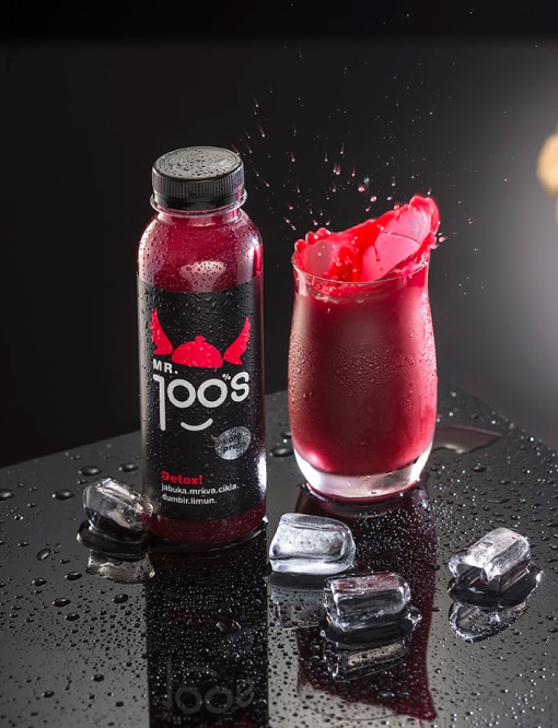
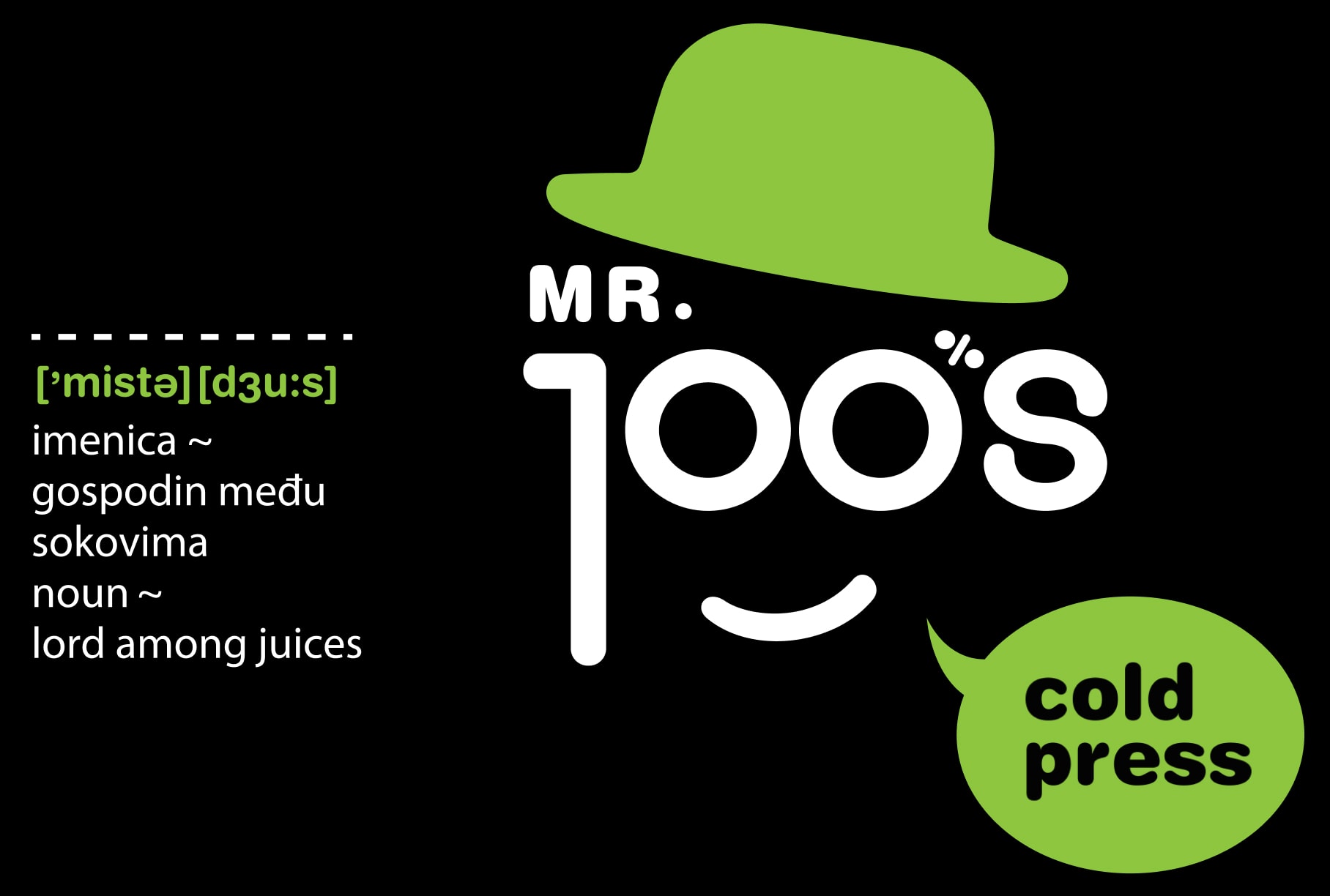
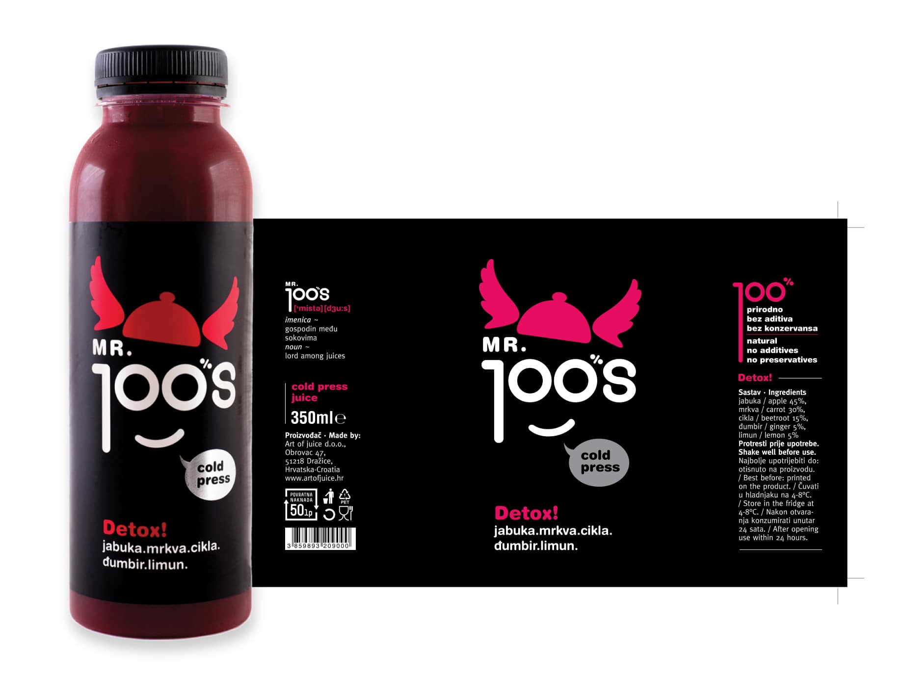
The word JUICE is creatively spelled as "JOOS", accompanied by a clear grammatical guide on the packaging and promotional materials to ensure correct pronunciation. The design cleverly incorporates the number 100%, highlighting the product’s commitment to being completely natural. Additionally, the face and eyes of “Mr. Joos” give the brand a unique personality, brought to life through various playful and engaging elements across the packaging and visual communication.
Color Palette

Typography

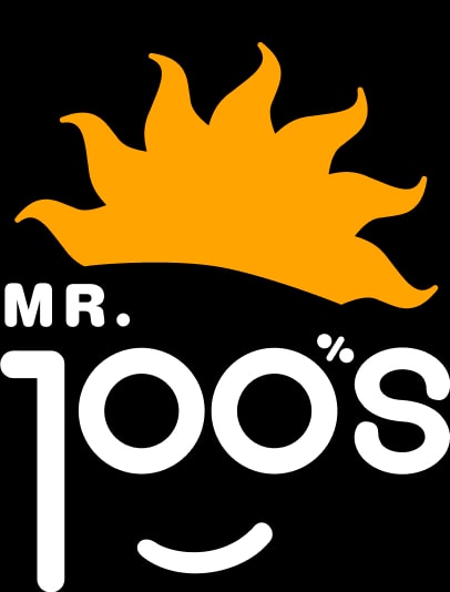
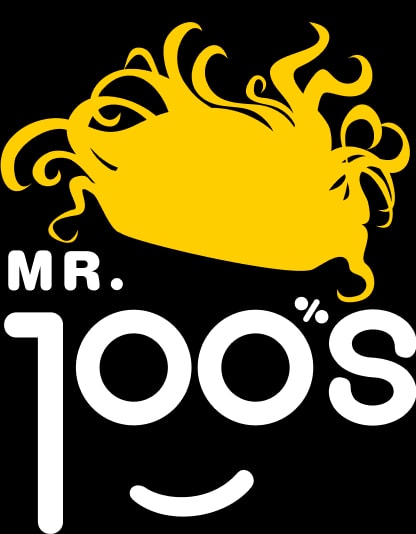
This packaging design allows each juice to showcase its own unique “character” and benefit. For example, the juice named "Hello" is pure orange juice, crafted to energize your morning. Reflecting this, Mr. Joos is given a playful “hair” shaped like the sun, reinforcing the fresh start and vitality the juice provides.
Meet the Gentlemen
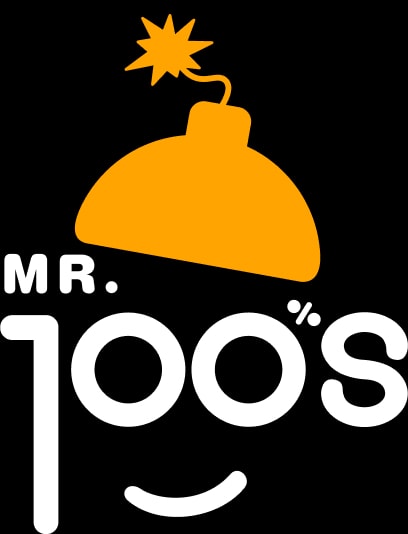
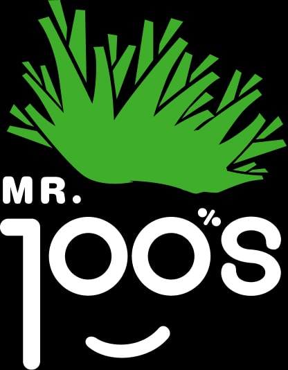
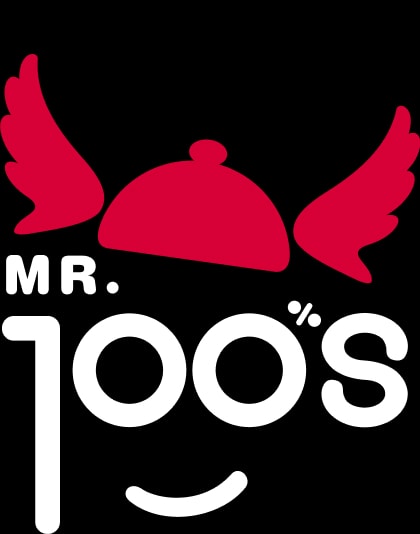
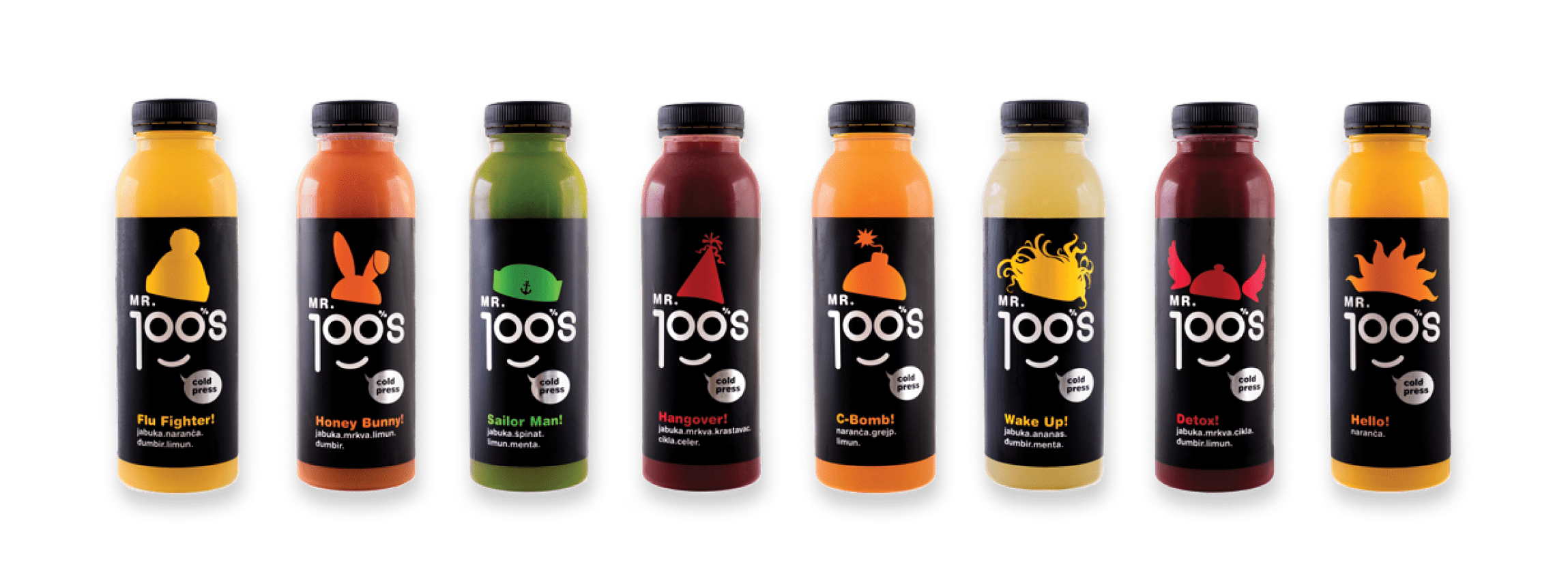
Each of the 11 juices in the current lineup is given a unique name and
corresponding graphic element to highlight its character. For example,
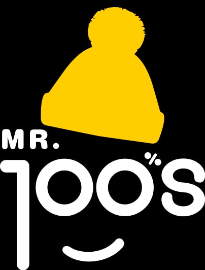
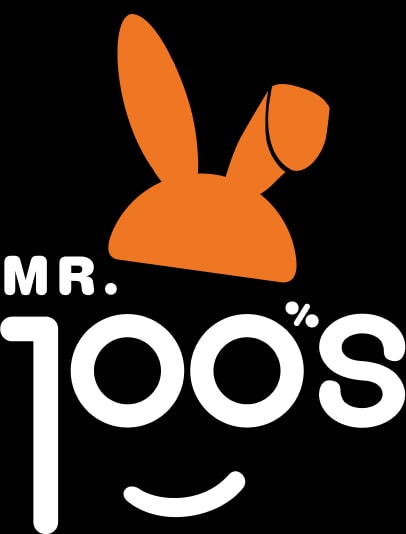
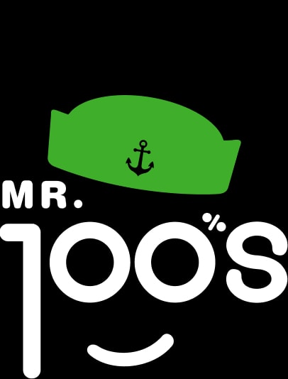
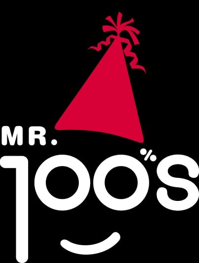
Detox features wings, Hangover sports a party hat, Sailor Man (spinach
juice) wears a sailor cap, Mojito dons a court jester’s hat, C-Bomb is
symbolized by a lit bomb, Flu Fighter has a winter cap, Honey Bunny
sports rabbit ears, Wake Up shows tousled morning hair, and Hello (pure
orange juice) radiates sun rays.
This playful combination of
visual and verbal elements allows each consumer to connect with a
specific juice flavor and personality. This engaging storytelling adds
significant value to the product and helps it stand out in the market.
The playful character of the Mr. Joos brand and the carefully
crafted visual language, developed through product packaging, have
opened wide possibilities for brand extensions as well as diverse
design solutions in communication materials.
The Mr.
Joos branding project has received recognition for its award-winning
packaging design and cohesive visual and verbal brand communication.
Other projects
So… get your brand to look nice and speak wise!

