CLIENT
OPG ŠPOLJAR
BRAND
FOUR KINGS
TYPE
BRANDING, PRODUCT PACKAGING, VERBAL COMMUNICATION
Fo(u)r Kings Premium Brand is a line of high-quality food products made
primarily from pumpkin and pumpkin-based ingredients. This product line
was created as a tribute to the pioneer of entrepreneurship in the
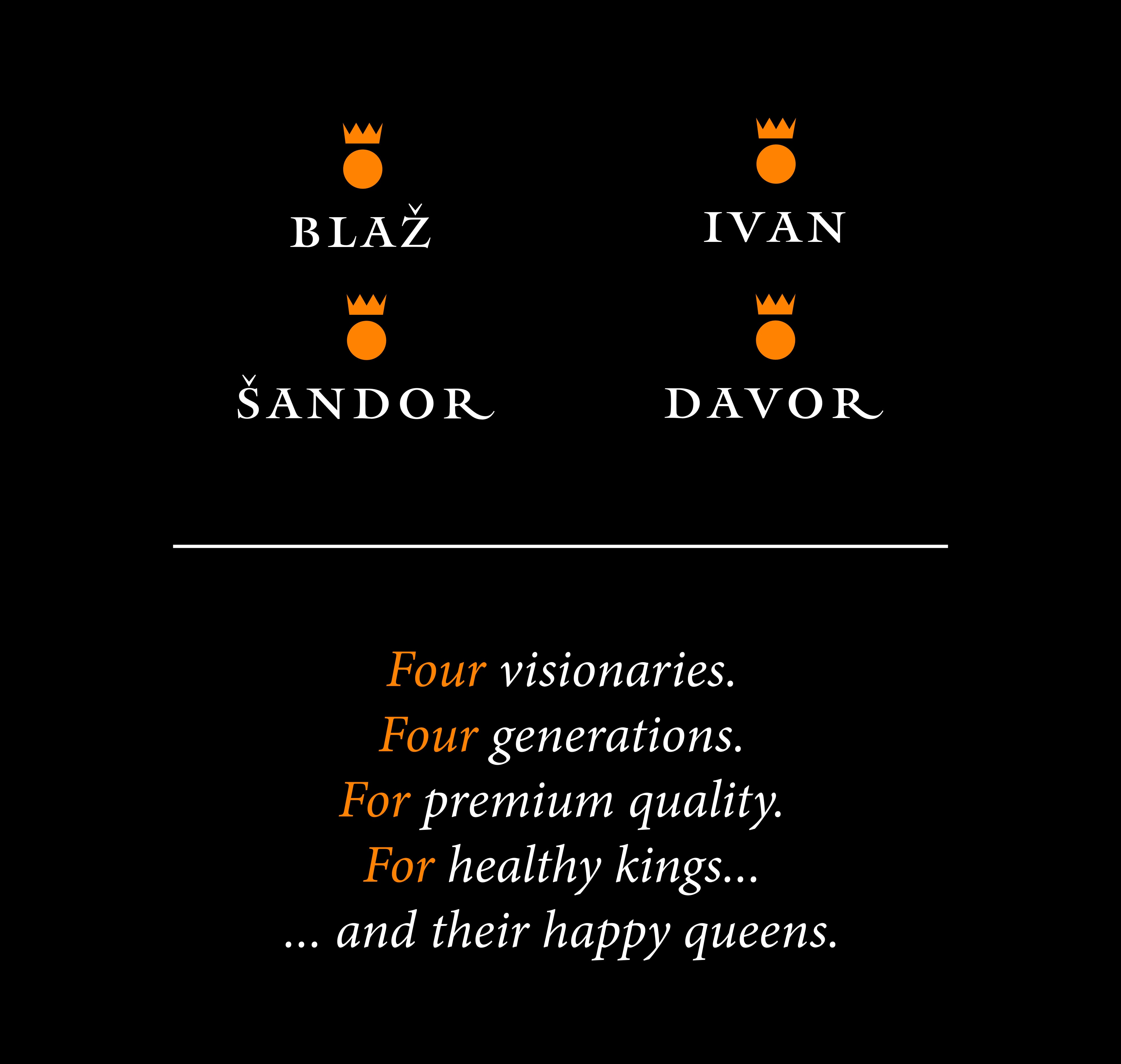
Špoljar family—Blaž Špoljar—and as a guarantee of quality nurtured
through four ("four") generations. The great-grandparents of Davor
Špoljar, the founder of the Fo(u)r Kings brand—Blaž and Gizela—lived in
Terezino Polje, where they cultivated five hectares of land, primarily
growing pumpkins. Among other products, Blaž sold pumpkin seeds at local
village markets.
He noticed that unlike other stalls, his
customers were mostly men. Today, we know about the health benefits of
pumpkin seeds, particularly for prostate cancer prevention. Blaž
recognized the connection between the increased "male" interest in his
product and began packaging the seeds into small bags, branding them as
"Man Power." Sadly, Blaž never returned from the front lines of World
War II. Gizela never remarried and spoke of him fondly even in her old
age. She welcomed the teasing of her children and grandchildren with a
smile, as they jokingly speculated that Blaž was probably the most loyal
consumer of his own product.
Over the next two generations, the Špoljar family continued to grow
pumpkins—exclusively for personal use—while Blaž’s entrepreneurial
spirit and his "Man Power" remained a beloved family story. Thanks to
Gizela, this story lived on and eventually inspired her great-grandson
Davor to follow in Blaž’s footsteps and embark on his own business
journey. This very story is the foundation of the Fo(u)r Kings brand:
- Four generations dedicated to cultivating the Styrian oil pumpkin
- Four “kings” of premium men’s health: Blaž Špoljar, Šandor Špoljar, Ivan Špoljar, and Davor Špoljar
- A premium, preservative-free, additive-free product—crafted for health and enjoyment
- A product made for kings—and happy queens (…for kings and happy queens…)
The Fo(u)r Kings project encompasses the full development of the brand concept—including visual and verbal communication, brand naming, brand strategy, visual identity design, and packaging design.
Fo(u)r Kings is more than just a premium food line—it's a legacy.
The brand name honors the rich heritage of the Špoljar family,
rooted in four generations of traditional pumpkin cultivation. At
the heart of this story is a commitment to health, particularly
men’s wellness, inspired by the pioneering spirit of Blaž Špoljar.
The name cleverly plays on the word “four”, symbolizing
both the family lineage and the natural power of pumpkin products,
long appreciated for their positive effects on men’s health.
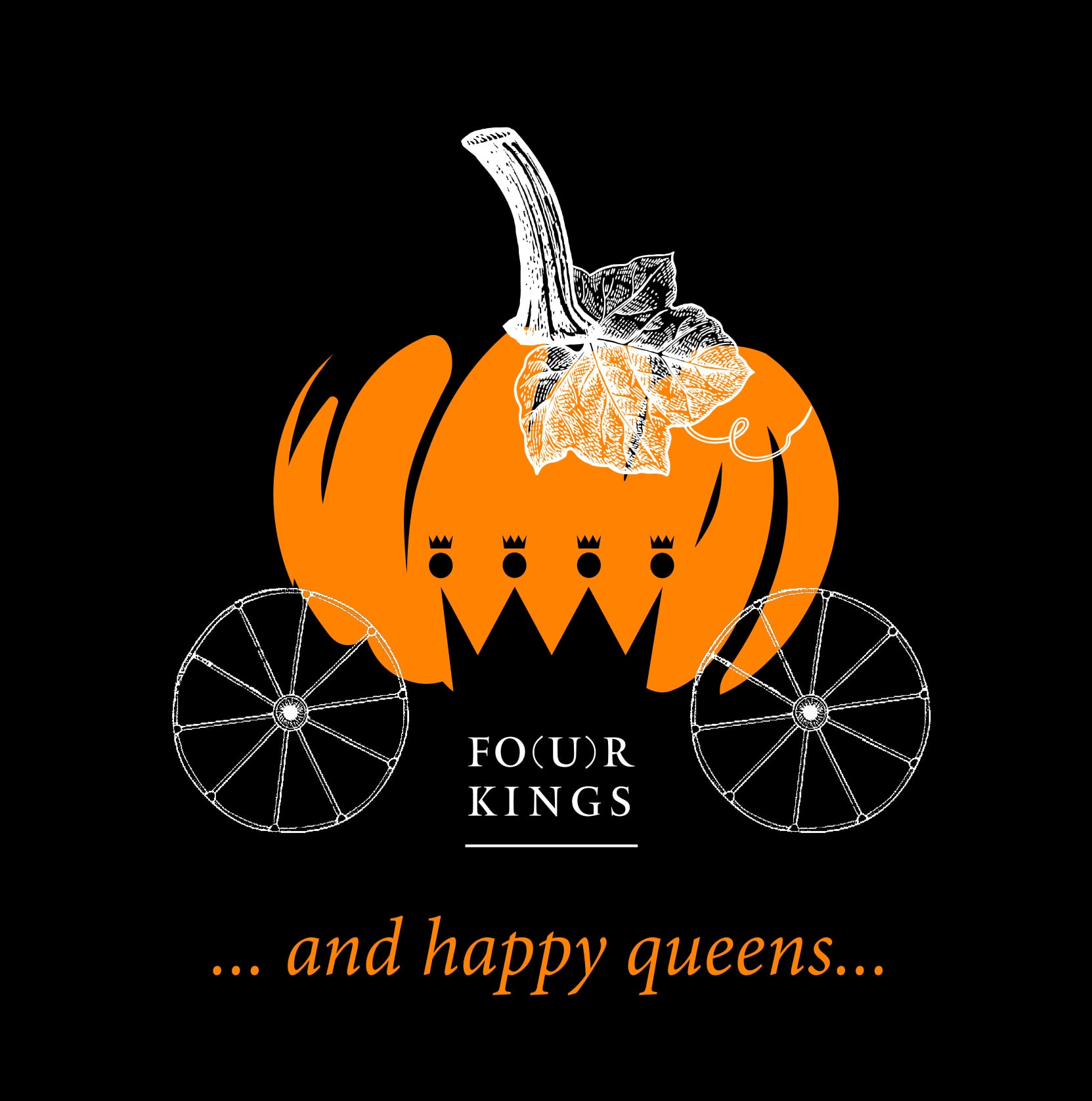
Our visual identity brings the name to life: four royal head
silhouettes, representing four kings, unite to form a single crown—a
symbol of strength, tradition, and continuity. The logo itself
incorporates the word “four”, speaking to our mission: to support
men who care about their health, and to offer a product fit not just
for kings—but for anyone who wants to feel their best. Fo(u)r Kings
is a tribute to tradition, a symbol of quality, and a celebration of
natural wellness—for kings and happy queens.
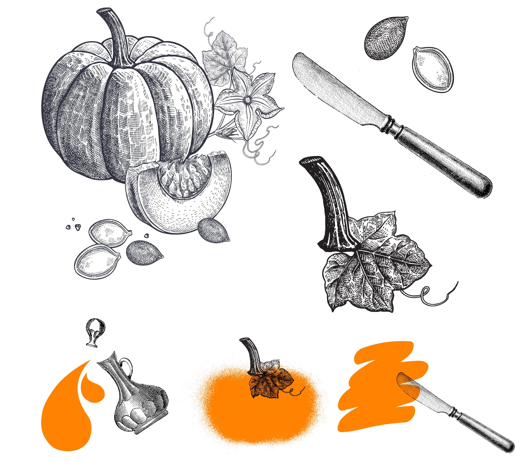
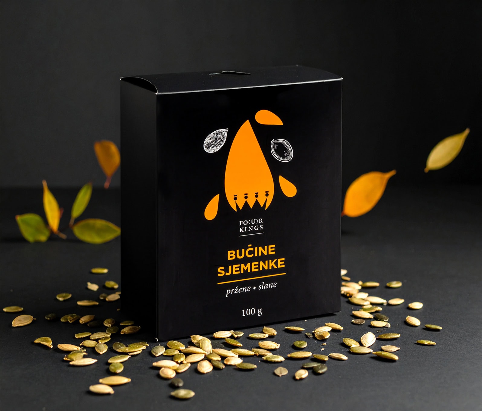
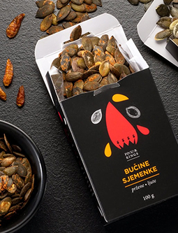
The Fo(u)r Kings packaging design is a direct reflection of the brand
story—capturing the rich historical background of a family tradition in
pumpkin cultivation and production. Given the closed-type packaging, the
visual concept plays a key role in presenting the product itself.
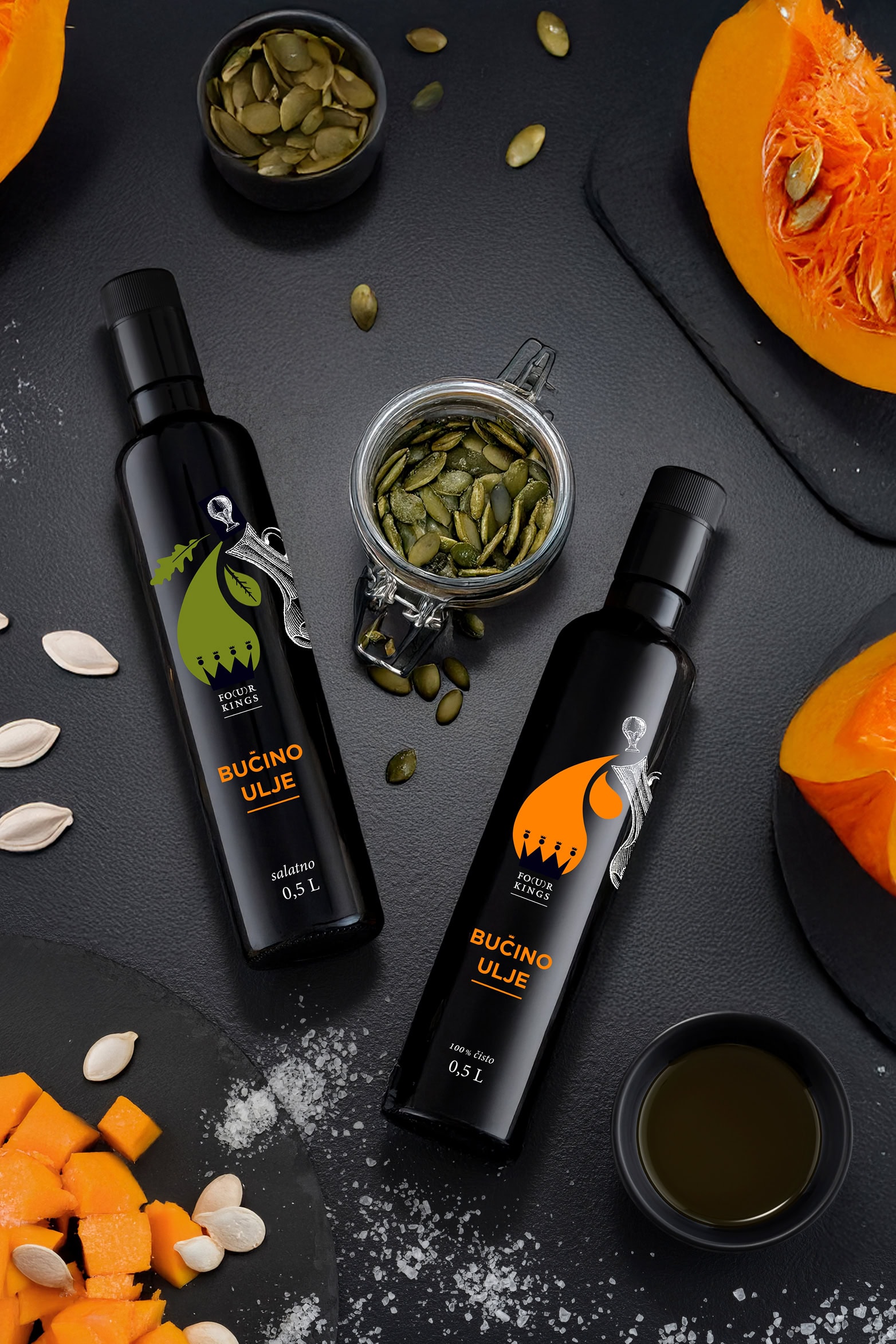
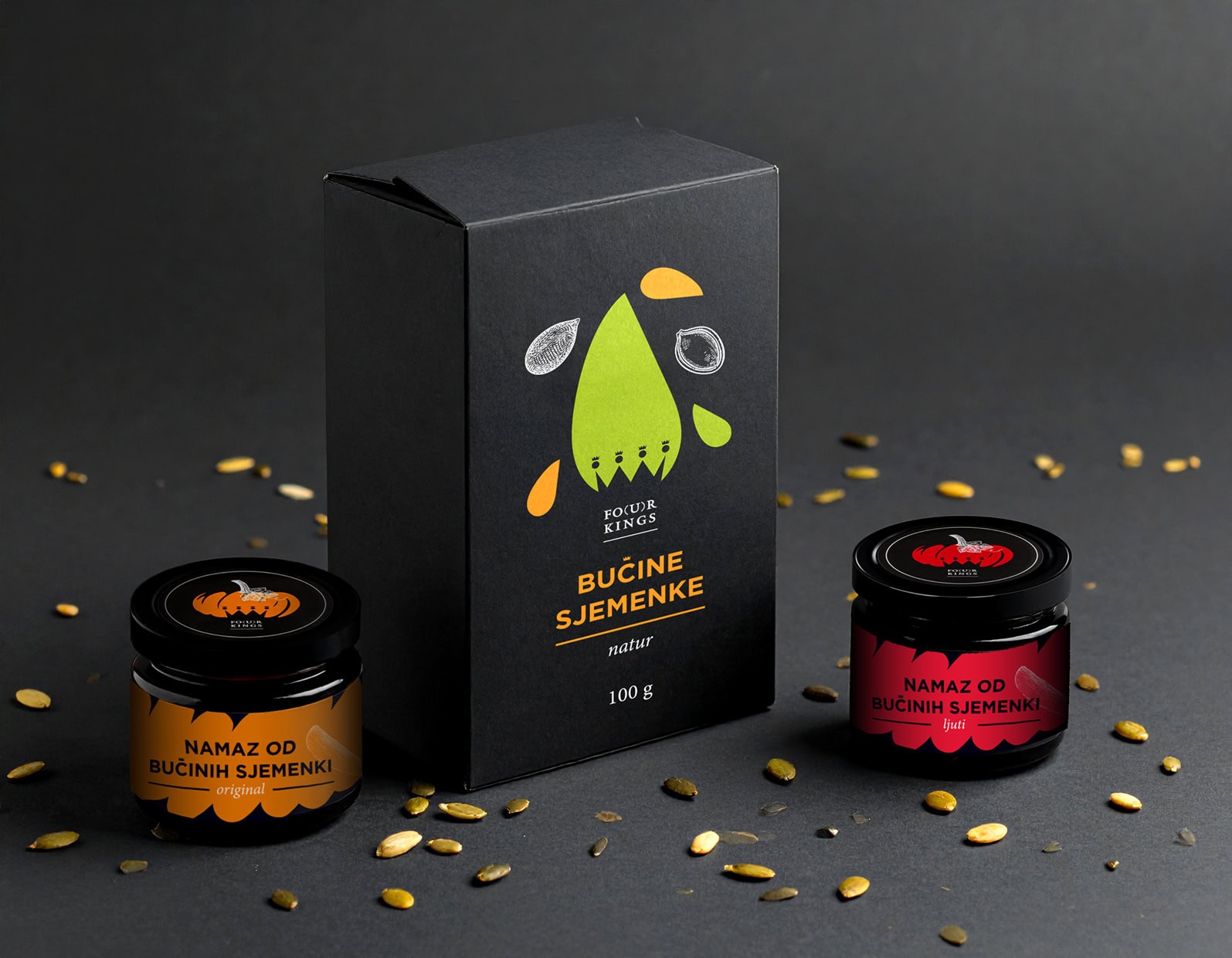
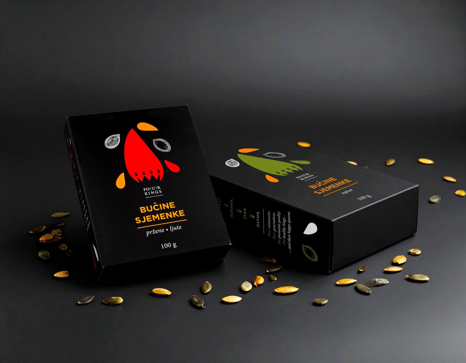
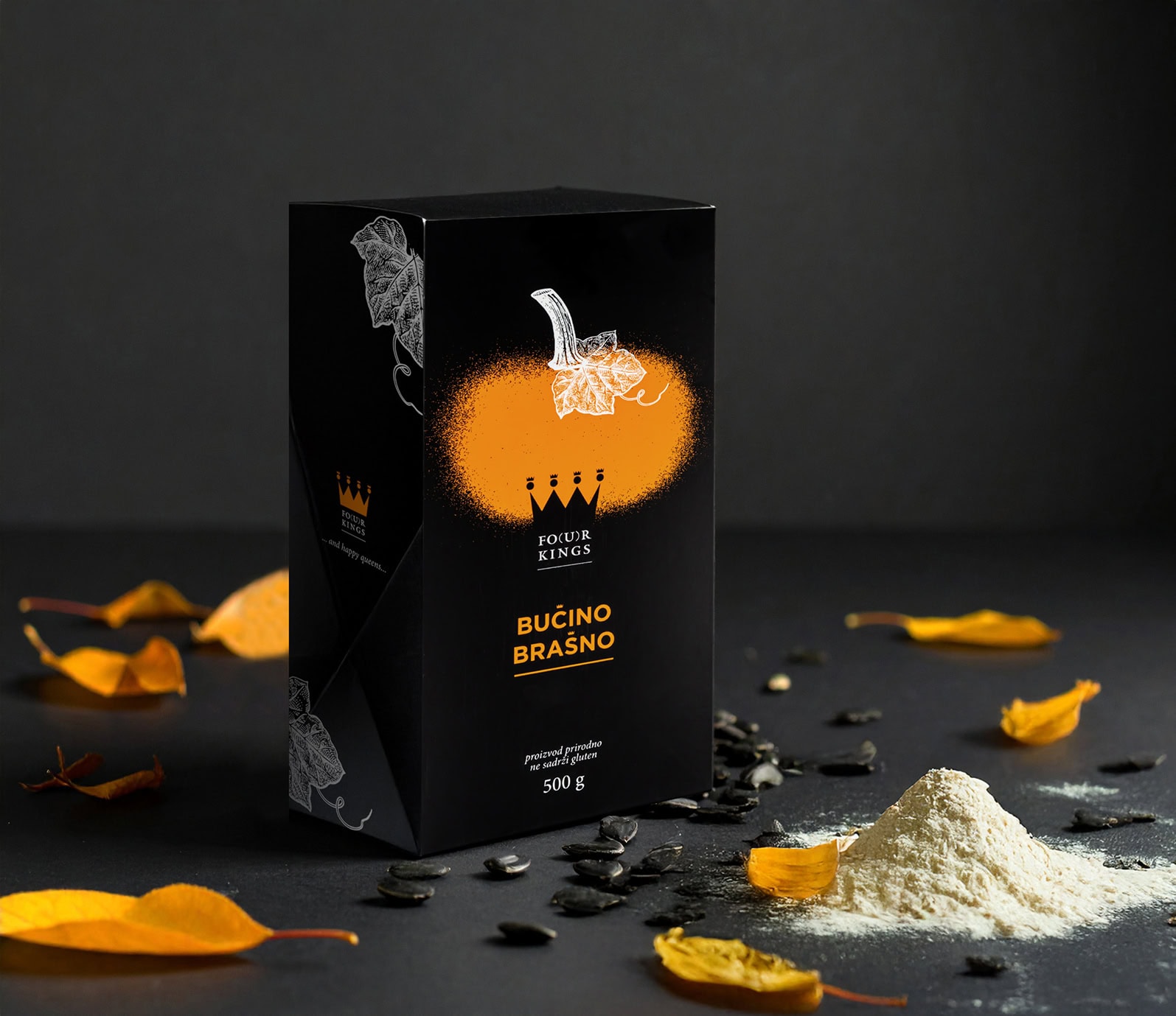
Each product category features a custom label design that
visually represents the texture and form of the contents:
- Whole pumpkin seeds: seed shapes in their natural form
- Spreads: knife strokes suggesting creamy texture
- Oils: drop shapes symbolizing liquid form
- Flours: powdery illustrations evoking a fine, ground texture
Every design includes supporting visual elements that reinforce the core idea—such as a small oil jug for oils, a knife for spreads, or leaves referencing the pumpkin plant.
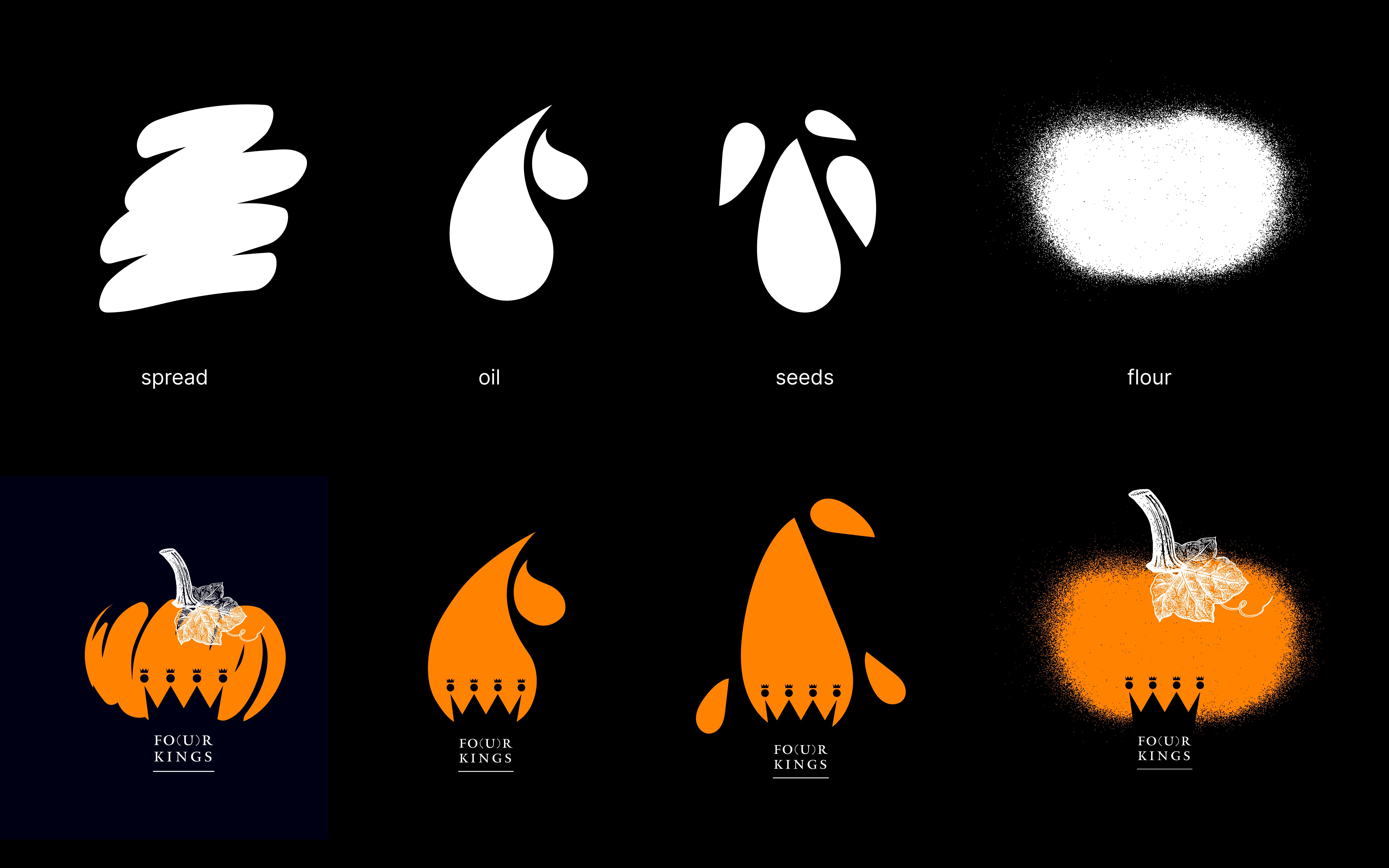
At the heart of each design, the Fo(u)r Kings logo is subtly placed in negative space, making it both a central branding element and an integral part of the overall visual composition across all packaging and promotional materials. The entire packaging identity is unified through a contrast of dark backgrounds, which enhance the premium feel of the brand, and vivid accent colors, used to add elegance and clarity to the graphic elements.


So… get your brand to look nice and speak wise!