CLIENT
CROATIAN MUSEUM OF TOURISM
BRAND
CROATIAN MUSEUM OF TOURISM
TYPE
VISUAL IDENTITY, VISUAL AND VERBAL COMMUNICATION
The Croatian Museum of Tourism is a relatively new institution that has been active for 10 years, celebrating Croatia’s rich tourist past and present through a wide range of activities. It pays homage to the golden age of tourism in Opatija — known as the “Old Lady” of Croatian tourism. The project for the Croatian Museum of Tourism involves developing the overall brand identity as well as all promotional and exhibition activities of the Museum.
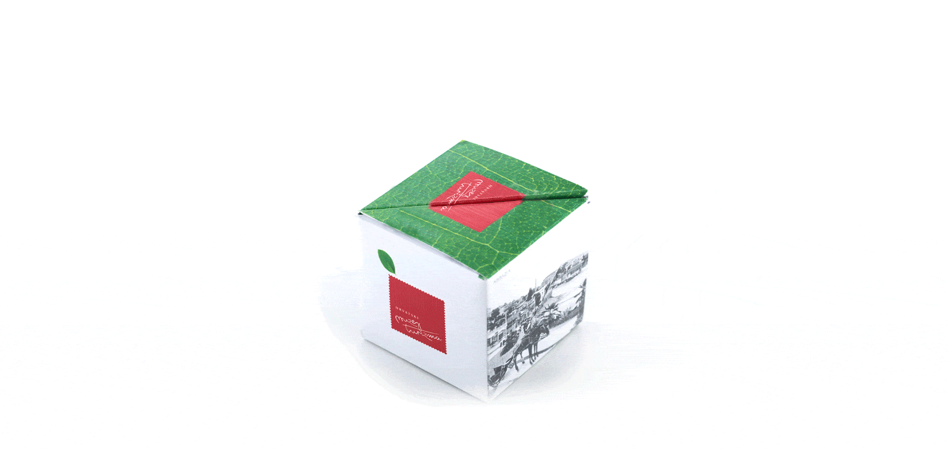
The development of the visual identity is rooted in core elements of Croatian national identity, notably the recognizable red checkerboard pattern. This motif is commonly used in the graphic design of similar institutions to emphasize their connection to tourism and everything it represents in the minds of users, tourists, and travelers. To foster an emotional connection and interaction between the target audience and the brand—thereby creating a strong, meaningful identity—the visual system incorporates a graphic element inspired by handwriting. This “handwritten” style evokes the idea of a signature or the personal touch of handwritten text, reminiscent of the emotions, memories, and special moments conveyed through a postcard sent from one person to another.

For these reasons, the identity and brand strategy of the Croatian
Museum of Tourism focus on evoking a unique emotion and memory. This is
achieved through graphic symbols such as the postage stamp—an element
that subtly incorporates the ambiguity of national affiliation with the
red checkerboard pattern, while also evoking the idea of a tourist
postcard.
Complementing this is the “signature” of the
postcard sender—elements that together become powerful associations of
tourism, as sending postcards to loved ones from various travel
destinations is what creates lasting tourist memories.
The packaging design for the Croatian Museum of Tourism souvenirs
included developing functional packaging for existing characteristic
souvenirs — such as laurel (a symbol of the city of Opatija), lavender,
and salt, representing Mediterranean traditions. A special box was
designed that, when opened, doubles as an informative booklet for each
individual souvenir. The box closes securely without the need for glue
or other adhesives.
In addition to classic souvenirs, a
unique piece was created for the Museum of Tourism — a handmade
butterfly figurine whose wings are crafted from segments of tourist
maps. Just as a butterfly is fleeting and constantly in motion, so too
is the traveler, the tourist, and their personality.
All activities of the institution are supported by the development of engaging graphic and other materials, which, through on-site sales, contribute to the museum’s stable economic situation. The creative strategy project—including the development of visual identity and accompanying materials—has, over five years of close collaboration with the museum’s management, resulted in a recognizable communication style and the establishment of a strong brand for the city of Opatija and the Kvarner region. This region continually invites visitors to journey back to the origins of tourism there, tracing its development up to the moment it became the beating heart of the Republic.


So… get your brand to look nice and speak wise!