CLIENT
GREEN I ORGANIC D.O.O.
BRAND
GREEN I
TYPE
BRANDING, PACKAGING, VISUAL AND VERBAL COMMUNICATION
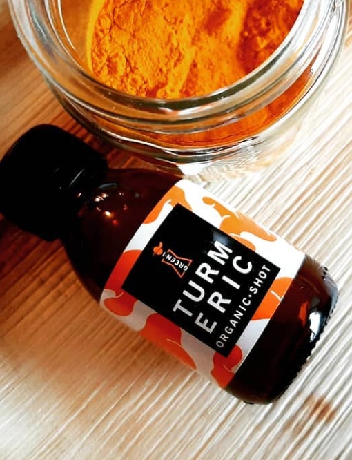
Green I – Branding Rooted in Nature
The branding of the Green I project draws its strength from the organic
essence of the products, brought to life through a modern and visually
compelling design approach. This comprehensive project encompassed the
full development cycle: from concept and creative strategy to brand
design, visual identity, and packaging design. Green I Organic is a
company specializing in the production and distribution of high-quality
chokeberry-based products, including royal jelly, teas, powders, and
natural juices. Certified with the EU Organic label, Green I products
are 100% natural—free from added sugars, artificial flavors, additives,
or preservatives. They are rich in nutritional value and offered through
both retail and wholesale channels. With its clean, contemporary visual
identity and commitment to organic quality, Green I positions itself as
a trusted name in healthy living.
A Personal Touch Rooted in Nature
With a strong environmental ethos and plans to expand into diverse
packaging formats, the visual identity of Green I is thoughtfully
designed to reflect both authenticity and sustainability. Inspired by
the owner’s family photographs and the organic shapes of the raw
ingredients, the brand’s core visual elements are deeply personal. At
the heart of the design is a stylized graphic of the company founder
during the chokeberry harvest—recognizable by her distinctive hat and
dress. This unique visual solution not only embodies the brand name,
Green I, but also creates a direct emotional connection between the
producer and the consumer. It resonates especially with women—mothers,
homemakers, and female entrepreneurs—who seek honest, healthy, and
nutritious products for themselves, their families, and their
communities. Green I stands as a symbol of care, integrity, and the
beauty of small-scale, mindful production.
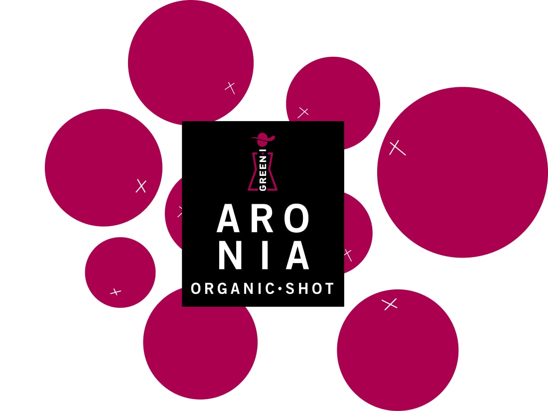
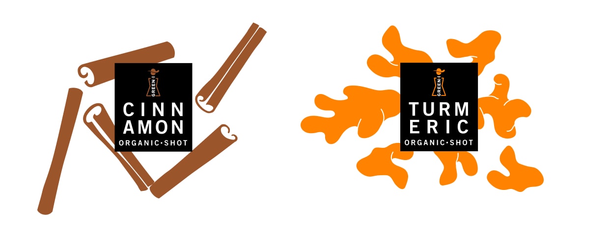
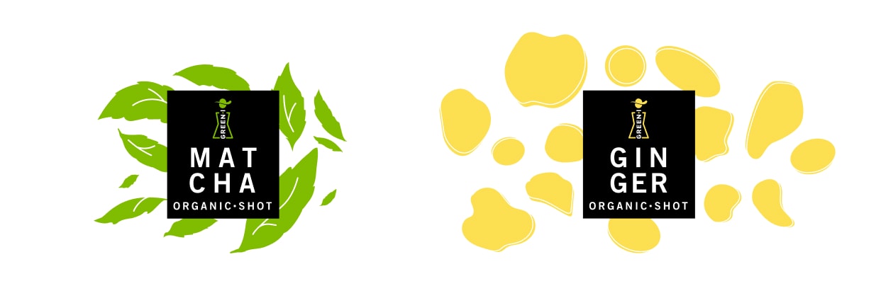
Distinctively Minimal, Naturally Bold
The Green I brand and packaging design stand out in a saturated market
through the power of minimalism and color. While many competitors rely
on photography or typographic-heavy visuals, Green I takes a refreshing
approach—rooted in nature-inspired forms and clean, modern aesthetics.
Organic shapes drawn from nature are transformed into graphic elements
that not only enhance product visibility but also elevate functionality
across all touchpoints. This departure from mainstream visuals enables
the brand to break through visual noise while reinforcing its
authenticity and ecological focus. The simplicity and clarity of the
design allow for dynamic visual storytelling—creating unique patterns,
eye-catching backgrounds, and emphasizing key product values such as
100% natural, organic-certified, and no additives. These elements lay a
strong foundation for building a cohesive and evolving visual language,
perfectly aligned with the positioning of Green I as a modern organic
brand.


So… get your brand to look nice and speak wise!