CLIENT
FRIGUS VECLA D.O.O.
BRAND
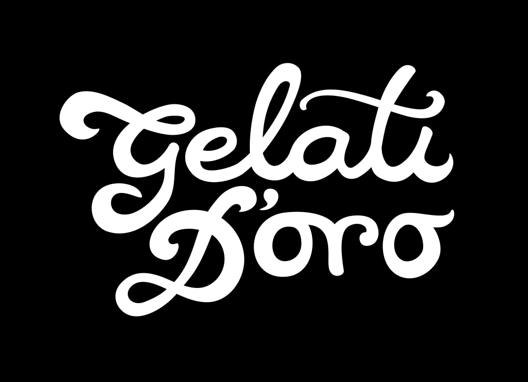
GELATI D'ORO
TYPE
BRANDING, PACKAGING, VISUAL AND VERBAL COMMUNICATION
Packaging design project for a range of products segmented into the
Premium, Natura, and Sport lines, along with the development of visual
communication for all promotional activities of the Frigus Vecla brand.
Behind the Gelati d’Oro brand stands the successful company Frigus
Vecla, based on the island of Krk, which has been producing high-quality
ice cream since 2004.
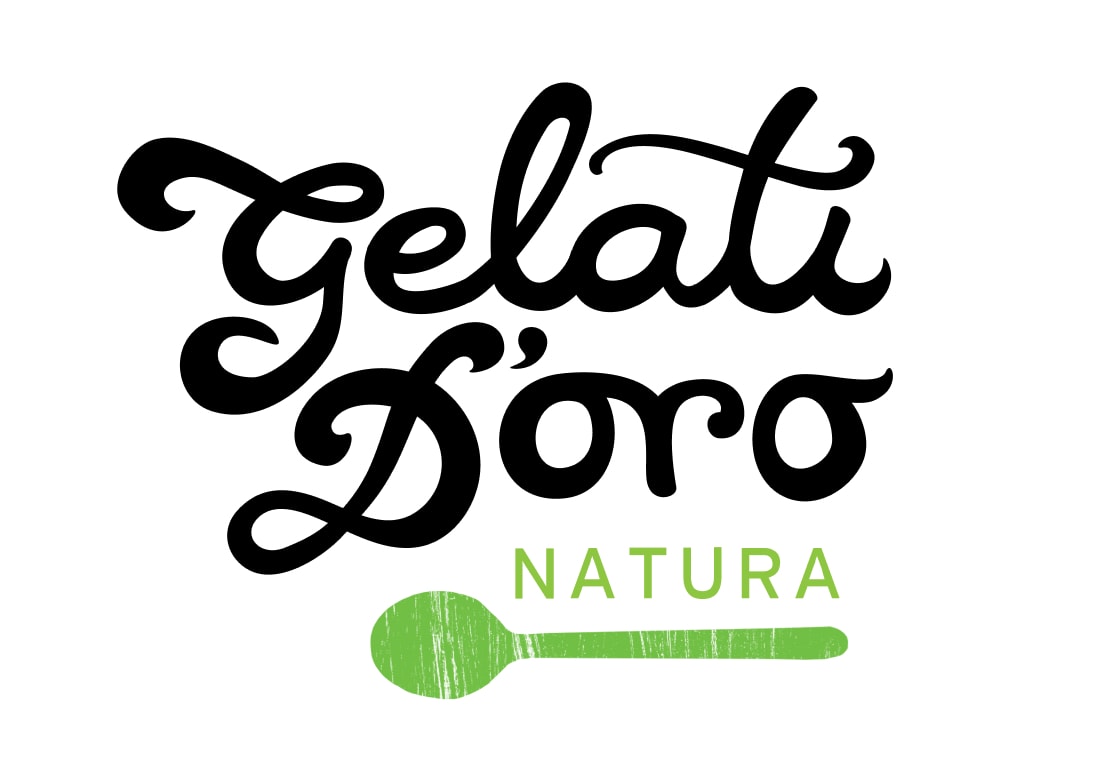
The Gelati D’Oro product line includes a variety of ice cream types and categories, all built around a core brand strategy: creating healthy, inclusive products suitable for everyone. The brand is particularly recognized for its unique range of vegan and gluten-free ice creams, crafted with innovative recipes that make it possible to enjoy ice cream in a health-conscious way. This approach is especially appealing to health-conscious consumers, individuals with special dietary needs, and those with health conditions such as gluten sensitivity, lactose intolerance, diabetes, or high blood pressure.
The project encompassed comprehensive product development — from brand concept and identity creation to packaging design and promotional materials. Although the company has been present on the market for over a decade, it had not previously collaborated with branding professionals. The existing brand name — which references the historical name of the island of Krk — was retained, but its visual presentation was redesigned to align with the new brand and packaging identity.

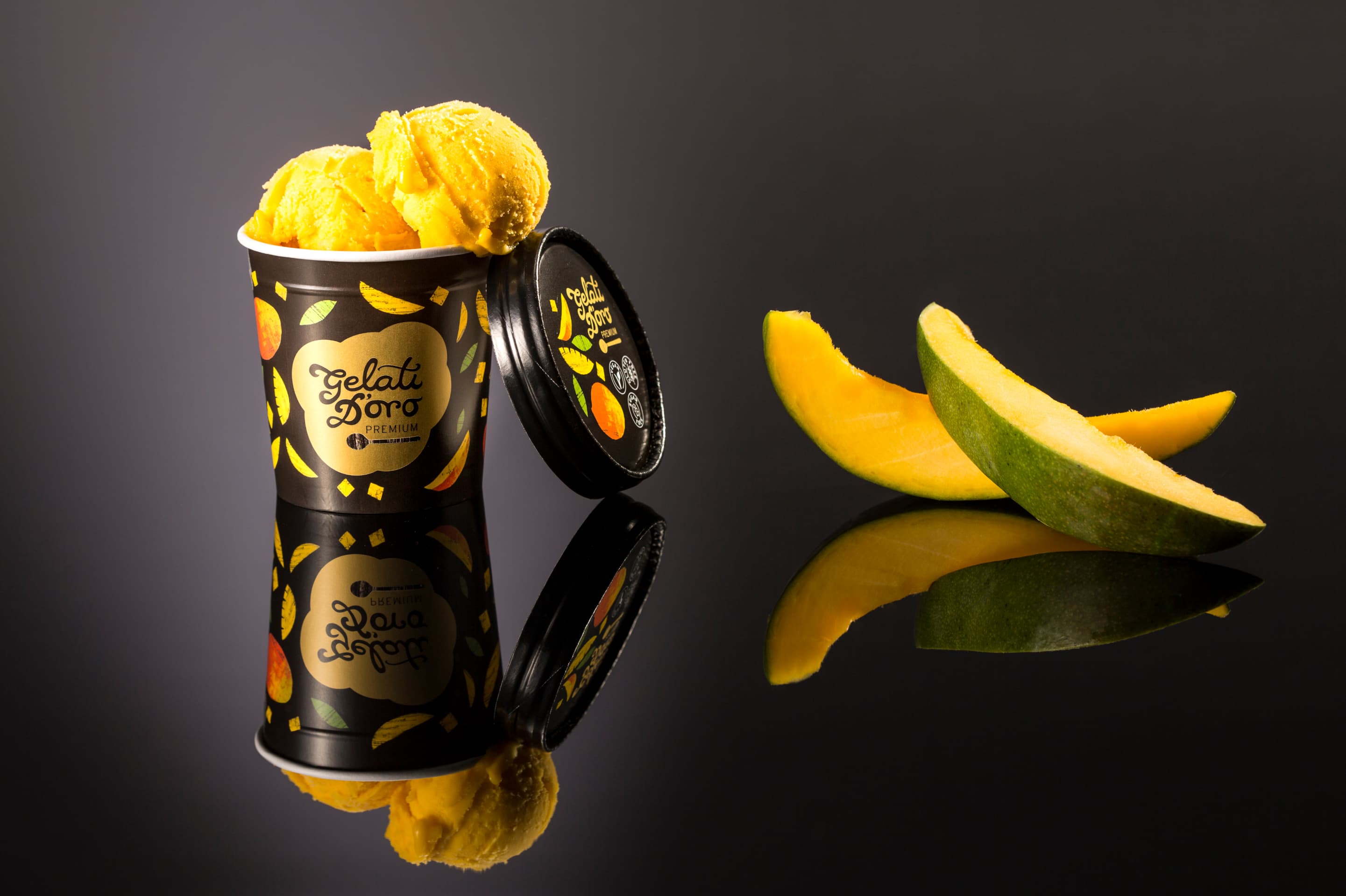
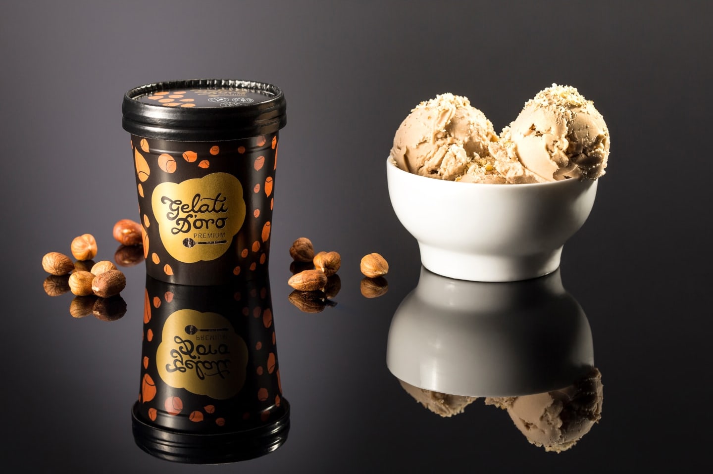
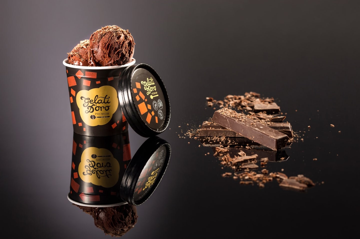
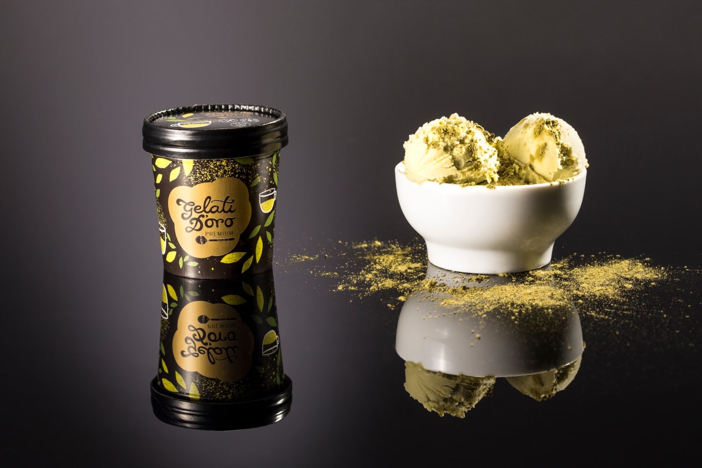
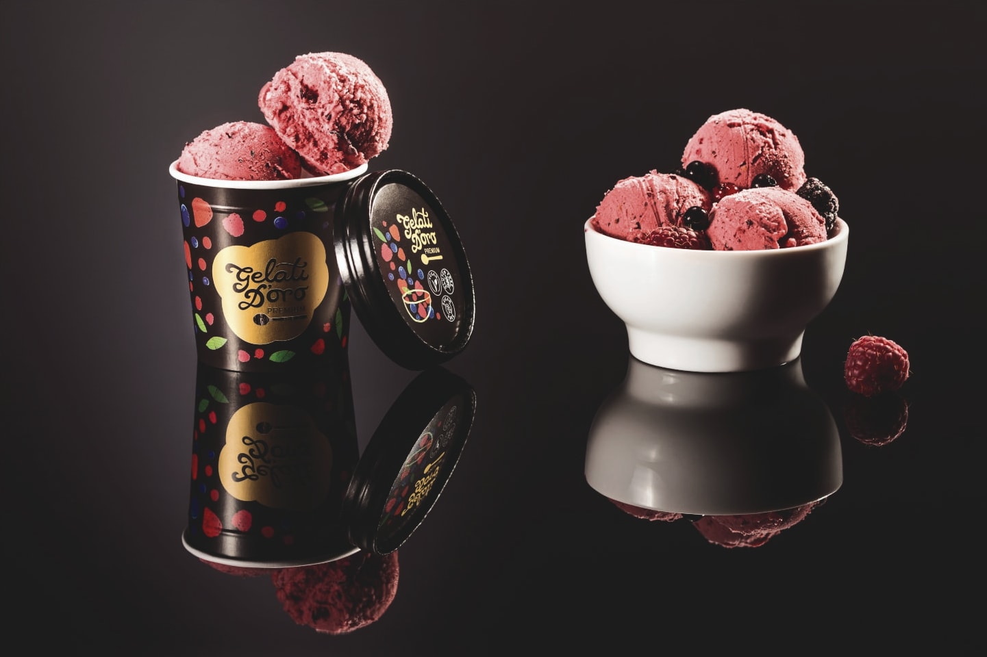
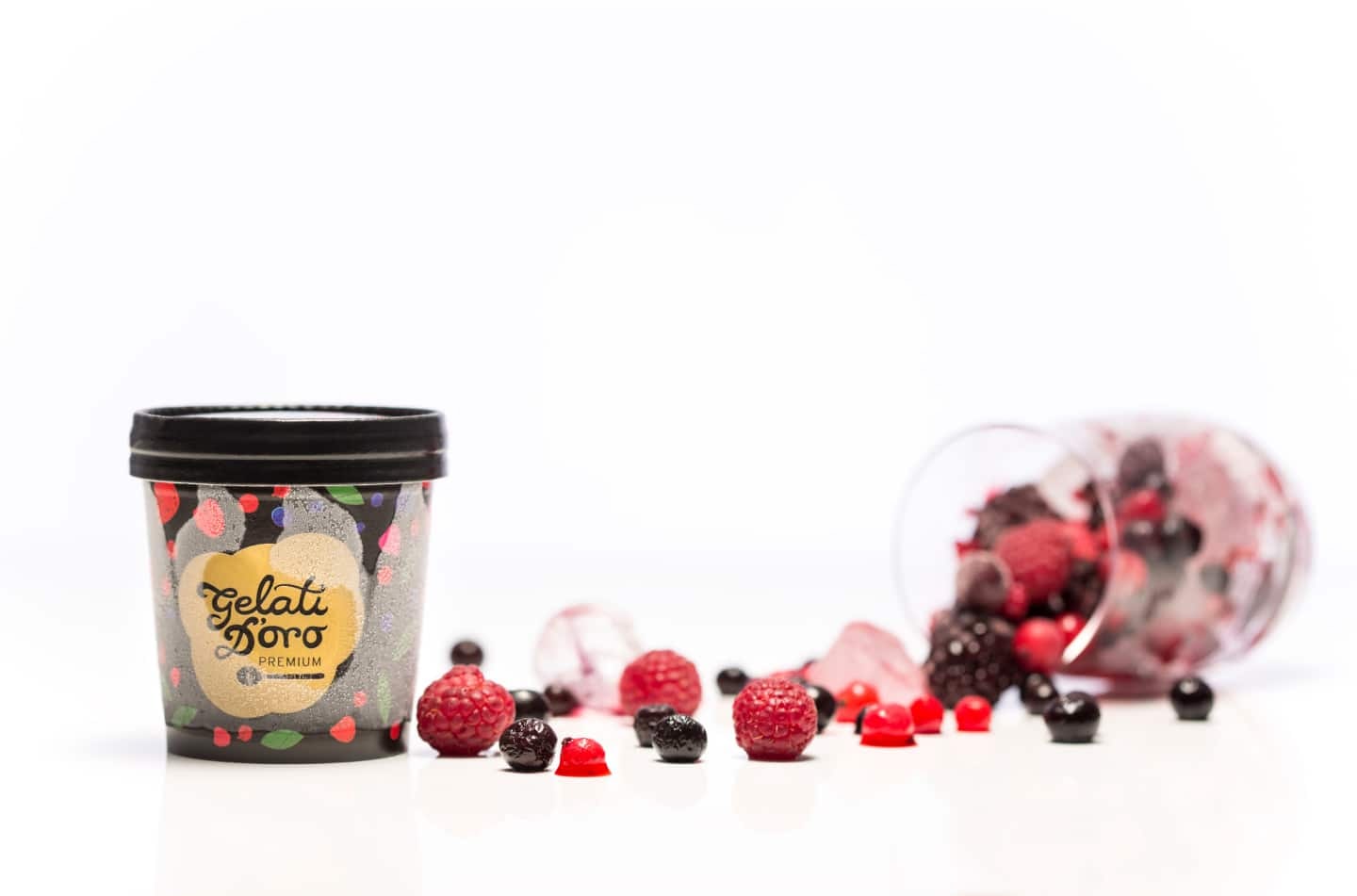
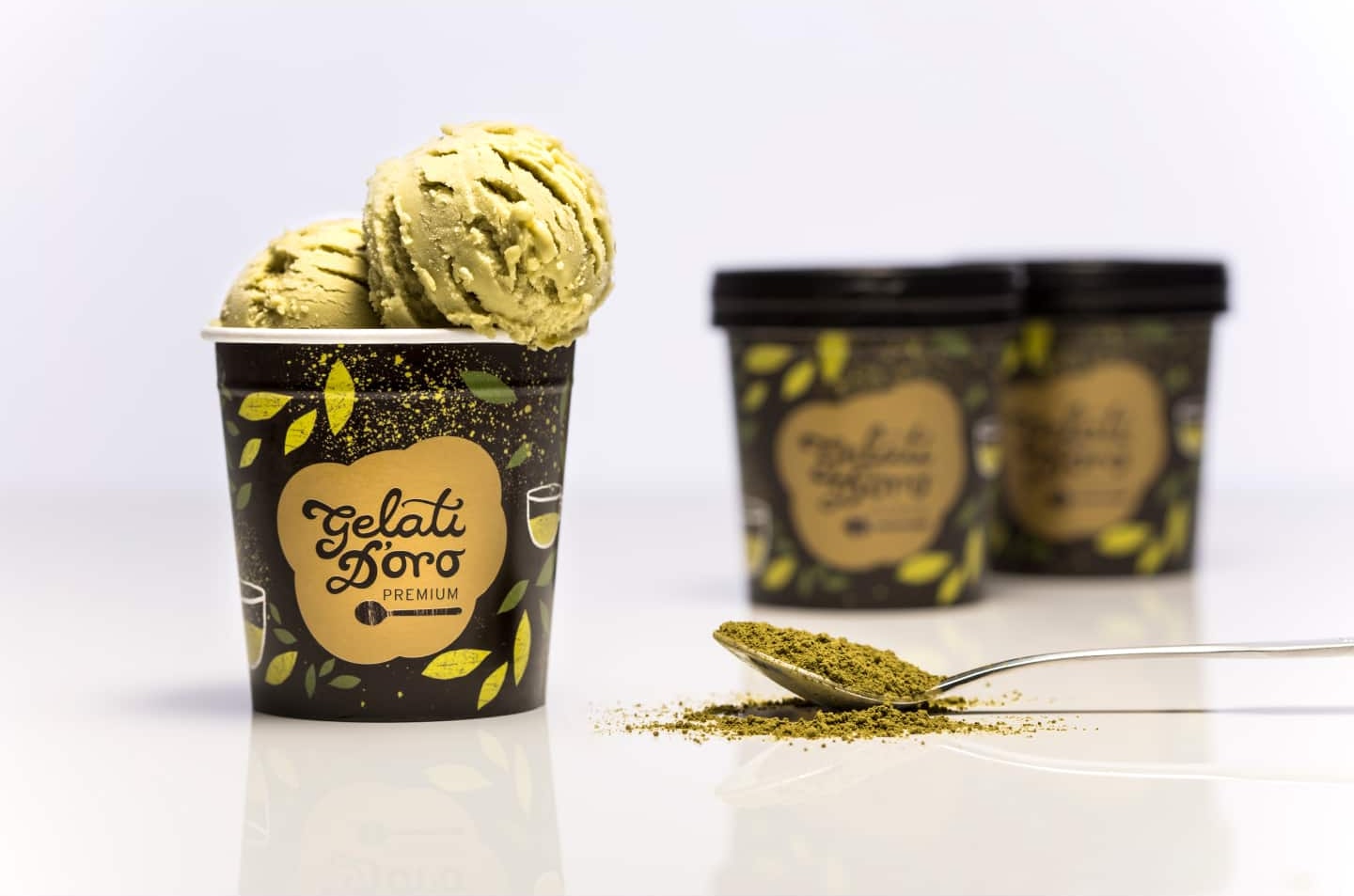
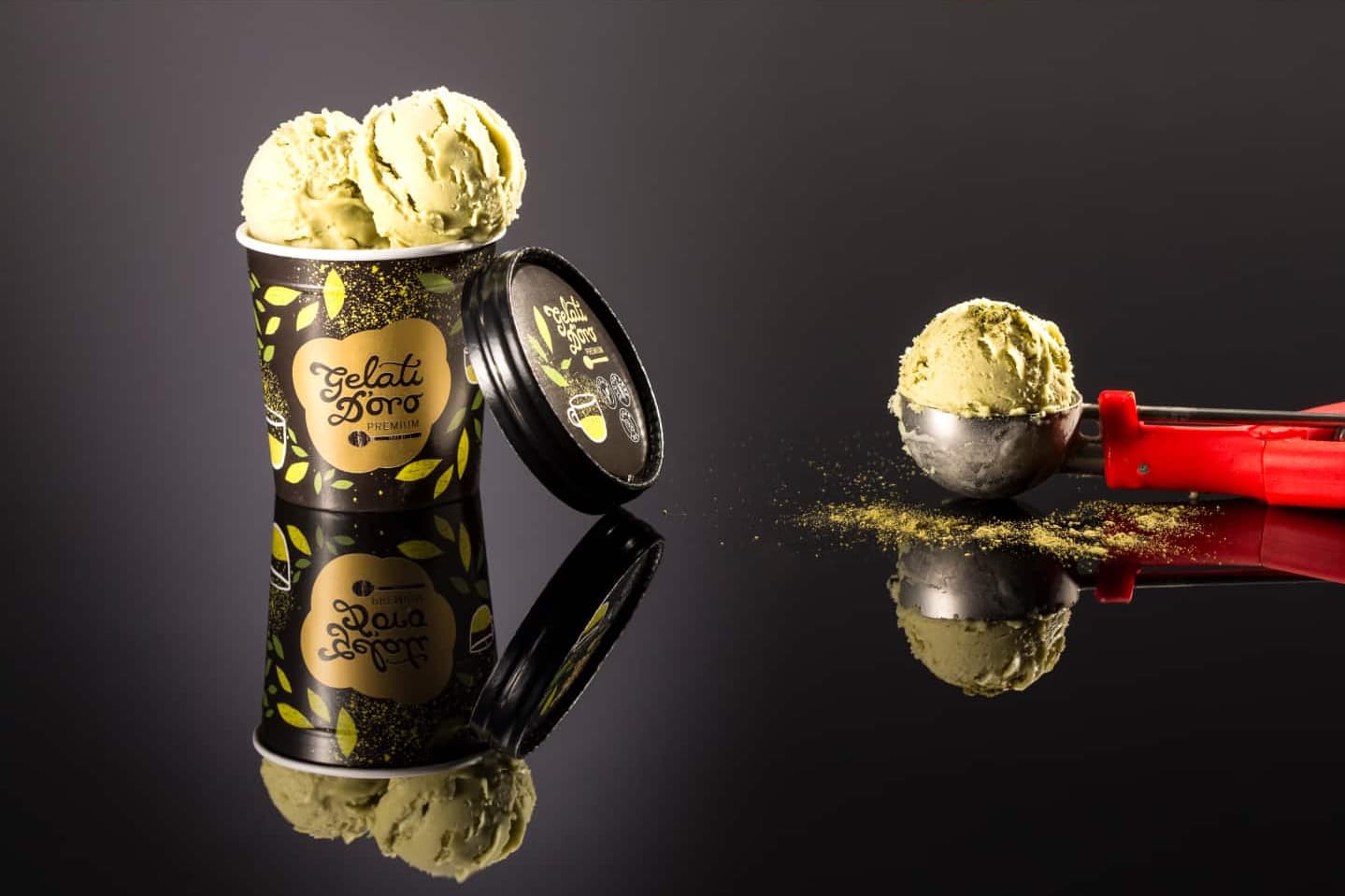
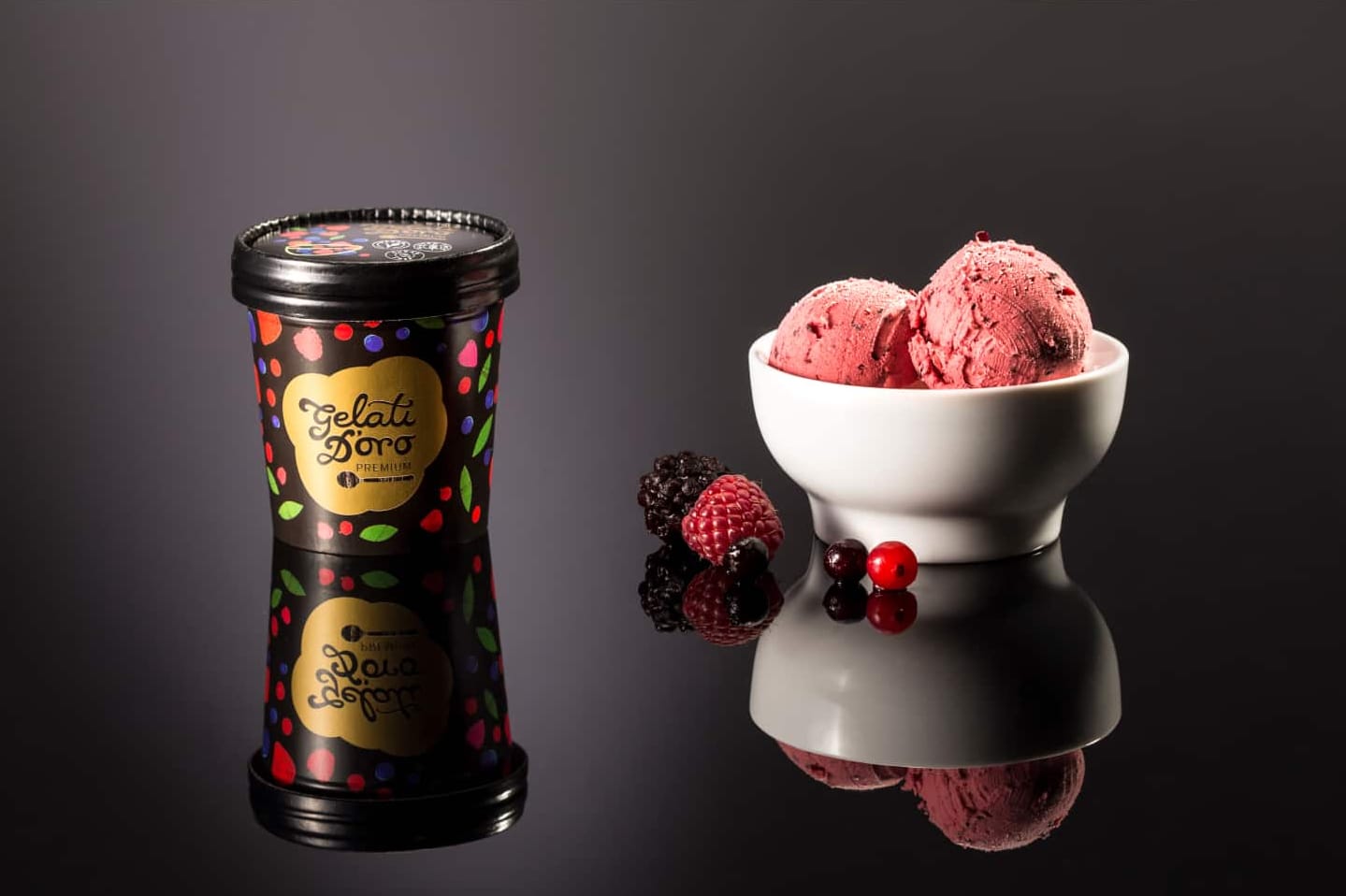
The packaging design is innovative, tailored specifically for “fast” or “take-away” consumption, targeting users who are constantly on the move and maintain a healthy lifestyle. To emphasize the convenient way of consumption — quickly eating with a spoon directly from the cup — an illustration of a spoon was incorporated alongside the logo. For the Sport product line, this concept was adapted by replacing the spoon illustration with a weight icon, symbolically connecting the brand to its target audience and emphasizing an active, fitness-oriented lifestyle.
The packaging’s shape and functionality stand out thanks to a practical
and innovative solution — a small cup design that the manufacturer
introduced to the local market for the first time by importing the
packaging form from Italy. This uniqueness makes the product highly
competitive.
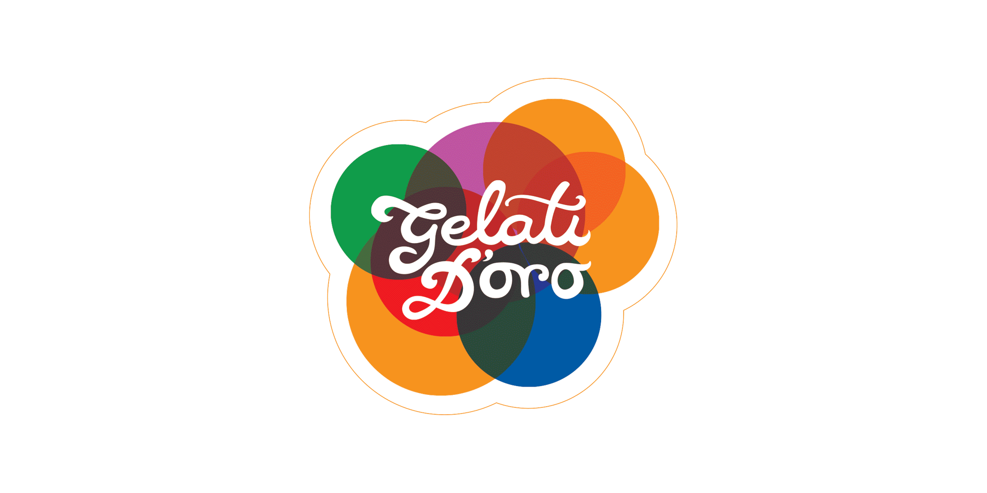
The brand’s visual identity is based on a soft, modern typography set
against an irregular, colorful background, which allows for versatile
applications. This design concept reflects the creamy texture of the ice
cream and is complemented by illustrations of the key ingredients
specific to each flavor. Currently, the Premium, Natura, and Sport
product categories are being developed to cater to the mentioned target
groups.
All promotional materials contain elements of visual identity placed through the packaging and complete the branding design project through sophisticated and attractive visuals.


So… get your brand to look nice and speak wise!