CLIENT
IGI D.O.O.
BRAND
RUZMARIN WINES, GRAPES AND OLIVE OIL
TYPE
PRODUCT VISUAL IDENTITY, PACKAGING DESIGN
The premium product range of Restaurant Ružmarin is part of the
Restaurant’s boutique shop, offering high-quality products under a
premium design and packaging category. Established in 1986, Restaurant
Ružmarin is a long-standing brand from the Kvarner Riviera, renowned as
a distinguished gastronomic destination with a rich tradition of
excellence. Recently, the Restaurant expanded to include a Boutique
Shop, presenting top-tier products under the Ružmarin brand: supreme
quality olive oils, Ružmarin wines (Chardonnay, Yellow Muscat, Cabernet
Sauvignon), homemade liquors (Dry Figs brandy, Teranino, Biska),
champagnes, as well as an assortment of cheeses, cured meats, and other
delicacies.
The project encompassed creating the boutique’s visual identity through
packaging design for Ružmarin wines, liquors, and champagnes. The design
draws inspiration from the values deeply rooted in the venue’s legacy
and its very name — Ružmarin (Rosemary). Since antiquity, rosemary has
symbolized friendship, remembrance, and love — ideals that the
restaurant embodies as a meeting place of friendship, exceptional
cuisine, and atmosphere; a space where history, present, and future
converge.
The packaging design of Ružmarin products — wines, liquors,
champagnes, and more — is primarily aimed at restaurant visitors,
especially international guests, who often become buyers of gifts,
souvenirs, and keepsakes. Each product is presented as a symbol and a
memory of special moments shared — whether dining with friends
(rosemary as a symbol of friendship), with a partner (rosemary
symbolizing love), or with business associates (rosemary representing
remembrance).
These themes are expressed in a fresh and
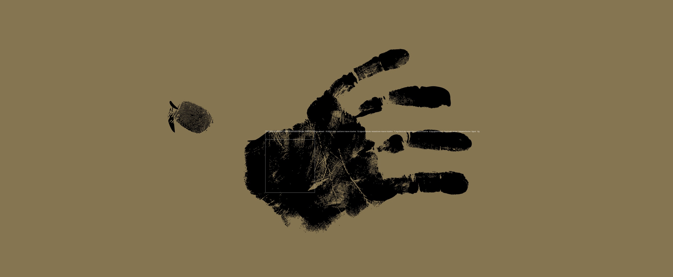
distinctive way. The core concept behind the packaging design is the
use of handprints — the unique signature of every individual —
emphasizing personal connection and authenticity.


The design of the “Friendship” wine label, featuring multiple handprints, carries a deeper meaning: it evokes the joyful moments shared with friends. As the wine is poured and the bottle is held, it is metaphorically marked by each person’s unique handprint — creating a personal signature and an unforgettable memory.


Similarly, the “Remembrance” bottles and liquor flasks feature a single handprint with detailed fingerprints, symbolizing lasting memories and enjoyable moments shared with business associates during informal, relaxed dinners. This design makes the product an elegant and meaningful choice for a distinguished business gift.


The “Love” champagnes are distinguished by two overlapping handprints that form the shape of a heart, symbolizing the cherished memories of a dinner and celebration shared with a life partner.
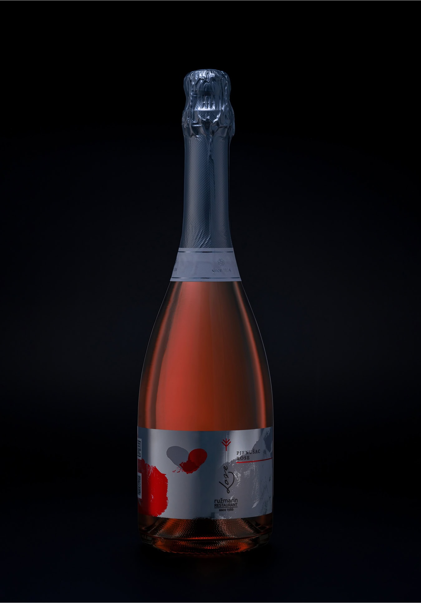
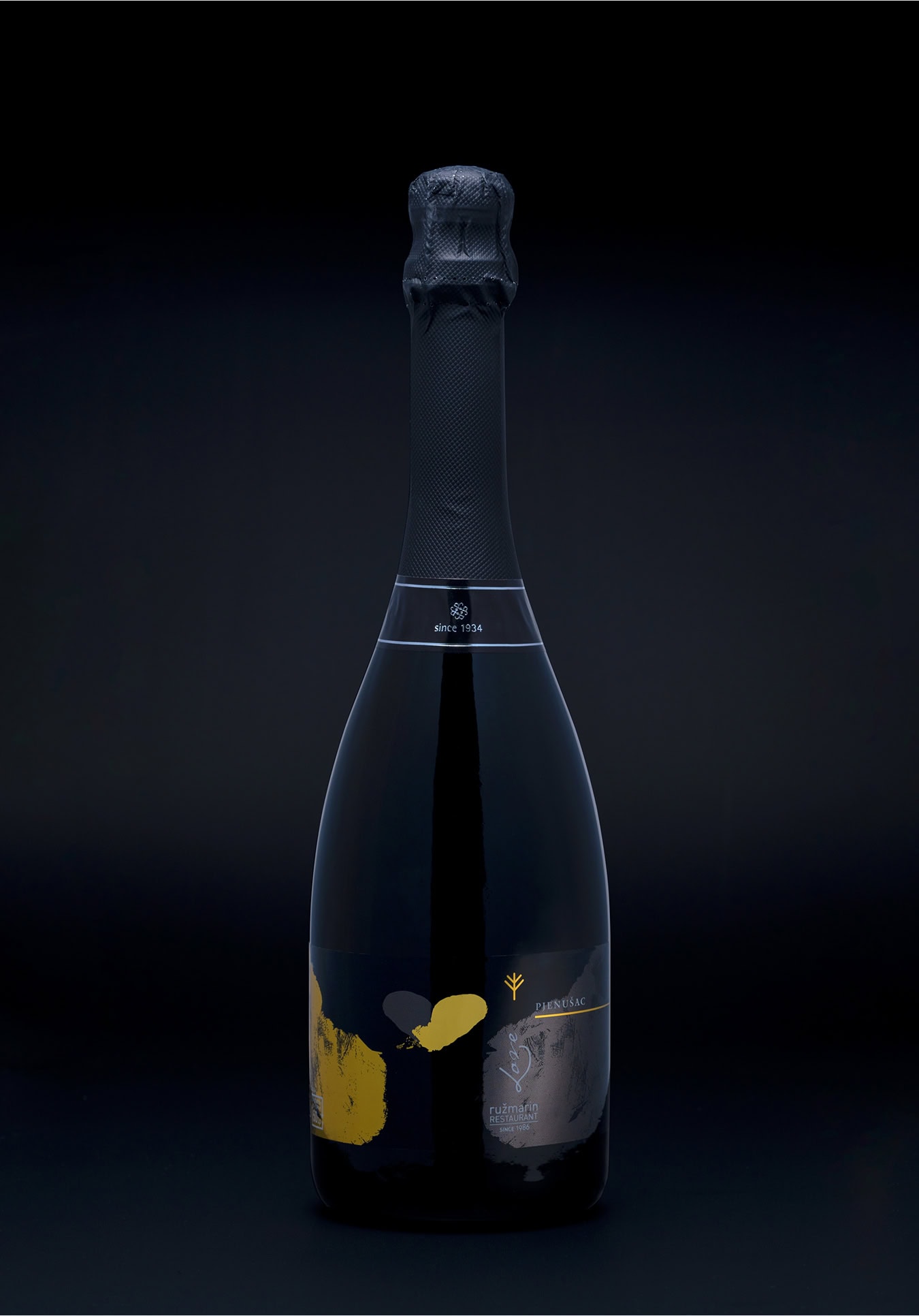
In this way, the products seamlessly connect with the existing Ružmarin Restaurant brand, creating a cohesive whole that communicates in a modern and emotional manner. At the same time, the design reflects a strong regional identity rooted in local traditional values. The Ružmarin packaging stands out from typical offerings, positioning the restaurant as a place where love, friendship, and memories are cherished — moments that can be “taken away” and carried forward. The choice of colors corresponds to the nature and typical usage of each product, such as specific wines or liquors. High-quality label materials, including silver polypropylene and glossy lamination, further emphasize the premium class of the products, adding a touch of elegance to every package.


So… get your brand to look nice and speak wise!