CLIENT
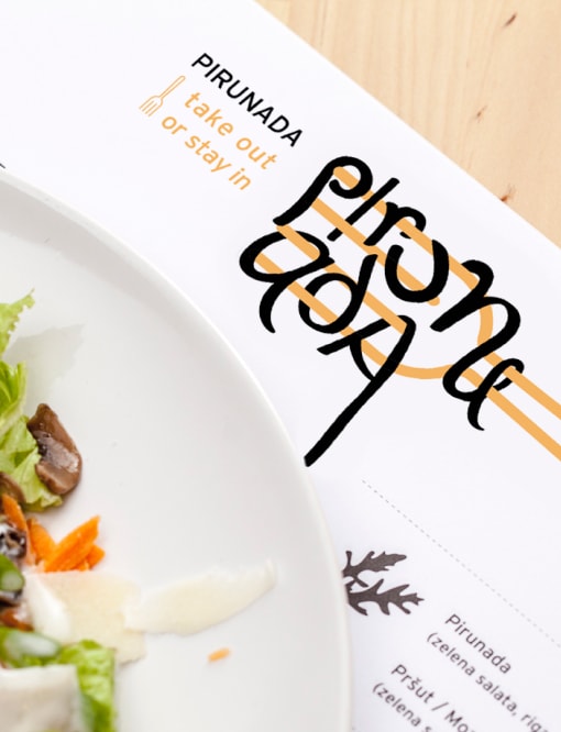
PIRUNADA - TAKE OUT OR STAY IN
BRAND
PIRUNADA - TAKE OUT OR STAY IN
TYPE
VISUAL IDENTITY OF THE RESTAURANT PIRUNADA IN THE CENTER OF THE CITY OF RIJEKA
Pirunada is a fast food restaurant built around a unique concept inspired by its name. The menu features traditional fast dishes, elevated by secret family recipes, designed to be enjoyed exclusively with a fork—no knife or spoon needed. Specialties include pasta, risotto, and other flavorful meals that perfectly fit this dining style.
The term “pirun” comes from the Chakavian dialect, spoken around Rijeka and its region, and means “fork.” The word “pirunada” refers to a perfectly sized bite — a round portion that fits neatly on one fork at a time, capturing the essence of the restaurant’s dining concept.
The concept behind Pirunada was to create a cozy "home restaurant" — a
place that feels like home, rooted in the traditions of the coastal
region. The creators aimed to design a welcoming spot for quick meals
and socializing, where everyone from Rijeka can instantly connect — not
only through the name but also through the warm, rustic atmosphere.
The interior celebrates local heritage with Chakavian
dialect words playfully displayed on the walls, and the menu featuring
local terms like “pashta” instead of pasta. Thoughtful details — crooked
forks repurposed as hangers or menu holders, a special place to hang
“borscht” (bags), or store “umbrella” (umbrellas) — all echo the
region’s charm.
The visual identity revolves around a clever graphic element: a fork
(“pirun”) around which the “pashta” (pasta) spirals, forming the logo
and perfectly capturing the spirit of the concept.


So… get your brand to look nice and speak wise!